# `Emerge.UI.Border`
[🔗](https://github.com/emerge-elixir/emerge/blob/v0.2.1/lib/emerge/ui/border.ex#L1)
Border styling attributes.
## Layout
Border width participates in layout in Emerge.
Content and child layout are inset by the sum of padding and border width on
each side. For an element with `padding(10)` and `Border.width(5)`, content
starts `15px` in from each edge.
For fixed-size elements, the outer size stays the same and border width
reduces the inner content area. For content-sized elements, the element grows
by the border widths.
Border width can affect layout even when no border is painted. Layout uses
`border_width`, while painting also requires `border_color`.
## Radius
Border width defaults to `0`, so `Border.rounded(8)` rounds the element
corners but does not draw a visible border by itself.
Rounded corners affect backgrounds and clipping, and also shape the border
when width and color are present.
## Shadows
`shadow/1` and `glow/2` create outer shadows. They are decorative and do not
affect layout.
Parent padding does not clip descendant rendering, so outer shadows can bleed
into a parent's padding.
Scroll containers clip outer shadows only on active scroll axes: `scroll_y`
clips top and bottom, `scroll_x` clips left and right. If both axes scroll,
the full scrollport clips the shadow, including rounded corners.
`inner_shadow/1` renders inside the element and does not bleed outside it.
## Examples
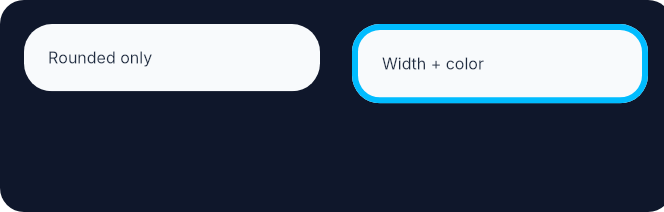
Rounded corners shape the element even before a visible border is added.
Adding width and color then paints the border on that same outline.
```elixir
row(
[
height(fill()),
spacing(16),
padding(12),
Background.color(color(:slate, 900)),
Border.rounded(12)
],
[
el(
[
width(px(148)),
padding(12),
Background.color(color(:slate, 50)),
Font.color(color(:slate, 800)),
Border.rounded(14)
],
text("Rounded only")
),
el(
[
width(px(148)),
padding(12),
Background.color(color(:slate, 50)),
Border.rounded(14),
Border.width(3),
Border.color(color(:sky, 400)),
Font.color(color(:slate, 800))
],
text("Width + color")
)
]
)
```
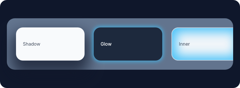
 Shadows are easiest to understand side by side: outer shadow bleeds outward,
glow is a zero-offset shadow, and inner shadow stays inside the element.
```elixir
el(
[
width(fill()),
height(fill()),
padding(12),
Background.color(color(:slate, 900)),
Border.rounded(12),
center_y()
],
row(
[
width(fill()),
padding(16),
spacing(16),
Background.color(color(:slate, 500)),
Border.rounded(14)
],
[
el(
[
width(px(120)),
height(px(58)),
padding(12),
Background.color(color(:slate, 50)),
Border.rounded(12),
Border.shadow(offset: {0, 16}, size: 8, blur: 24, color: color_rgba(15, 23, 42, 0.7)),
center_y(),
Font.color(color(:slate, 800))
],
text("Shadow")
),
el(
[
width(px(120)),
height(px(58)),
padding(12),
Background.color(color(:slate, 800)),
Border.rounded(12),
Border.glow(color_rgba(56, 189, 248, 0.55), 3),
center_y(),
Font.color(color(:slate, 50))
],
text("Glow")
),
el(
[
width(px(120)),
height(px(58)),
padding(12),
Background.color(color(:slate, 100)),
Border.rounded(12),
Border.width(1),
Border.color(color(:slate, 300)),
Border.inner_shadow(
offset: {0, 0},
size: 8,
blur: 18,
color: color_rgba(56, 189, 248, 0.9)
),
center_y(),
Font.color(color(:slate, 800))
],
text("Inner")
)
]
)
)
```
Shadows are easiest to understand side by side: outer shadow bleeds outward,
glow is a zero-offset shadow, and inner shadow stays inside the element.
```elixir
el(
[
width(fill()),
height(fill()),
padding(12),
Background.color(color(:slate, 900)),
Border.rounded(12),
center_y()
],
row(
[
width(fill()),
padding(16),
spacing(16),
Background.color(color(:slate, 500)),
Border.rounded(14)
],
[
el(
[
width(px(120)),
height(px(58)),
padding(12),
Background.color(color(:slate, 50)),
Border.rounded(12),
Border.shadow(offset: {0, 16}, size: 8, blur: 24, color: color_rgba(15, 23, 42, 0.7)),
center_y(),
Font.color(color(:slate, 800))
],
text("Shadow")
),
el(
[
width(px(120)),
height(px(58)),
padding(12),
Background.color(color(:slate, 800)),
Border.rounded(12),
Border.glow(color_rgba(56, 189, 248, 0.55), 3),
center_y(),
Font.color(color(:slate, 50))
],
text("Glow")
),
el(
[
width(px(120)),
height(px(58)),
padding(12),
Background.color(color(:slate, 100)),
Border.rounded(12),
Border.width(1),
Border.color(color(:slate, 300)),
Border.inner_shadow(
offset: {0, 0},
size: 8,
blur: 18,
color: color_rgba(56, 189, 248, 0.9)
),
center_y(),
Font.color(color(:slate, 800))
],
text("Inner")
)
]
)
)
```
 # `color_value`
```elixir
@type color_value() :: Emerge.UI.Color.color() | Emerge.UI.Color.t()
```
# `radius`
```elixir
@type radius() :: number() | {number(), number(), number(), number()}
```
# `shadow_options`
```elixir
@type shadow_options() :: keyword()
```
# `shadow_value`
```elixir
@type shadow_value() :: %{
offset_x: number(),
offset_y: number(),
size: number(),
blur: number(),
color: color_value(),
inset: boolean()
}
```
# `style`
```elixir
@type style() :: :solid | :dashed | :dotted
```
# `t`
```elixir
@type t() ::
{:border_radius, radius()}
| {:border_width, width_value()}
| {:border_color, color_value()}
| {:border_style, style()}
| {:box_shadow, shadow_value()}
```
# `width_value`
```elixir
@type width_value() :: number() | {number(), number(), number(), number()}
```
# `color`
```elixir
@spec color(color_value()) :: {:border_color, color_value()}
```
Set border color
# `dashed`
```elixir
@spec dashed() :: {:border_style, :dashed}
```
Dashed border style
# `dotted`
```elixir
@spec dotted() :: {:border_style, :dotted}
```
Dotted border style
# `glow`
```elixir
@spec glow(color_value(), number()) :: {:box_shadow, shadow_value()}
```
Add a uniform glow around the element.
Sugar for `shadow/1` with zero offset.
Decorative only. `glow/2` follows the same bleed and scroll-axis clipping
behavior as outer shadows.
# `inner_shadow`
```elixir
@spec inner_shadow(shadow_options()) :: {:box_shadow, shadow_value()}
```
Add an inner shadow (inset box shadow).
Same options as `shadow/1` but rendered inside the element.
Decorative only. Inner shadows do not affect layout and stay inside the
element.
# `rounded`
```elixir
@spec rounded(radius()) :: {:border_radius, radius()}
```
Round the element corners. This does not draw a visible border unless width and color are also set.
# `rounded_each`
```elixir
@spec rounded_each(number(), number(), number(), number()) ::
{:border_radius, radius()}
```
Round each element corner individually. This does not draw a visible border unless width and color are also set.
# `shadow`
```elixir
@spec shadow(shadow_options()) :: {:box_shadow, shadow_value()}
```
Add an outer box shadow.
Decorative only. Outer shadows do not affect layout.
Parent padding does not clip descendant rendering, so outer shadows can bleed
into a parent's padding.
Scroll containers clip outer shadows only on active scroll axes.
Options:
- `:offset` - `{x, y}` offset (default `{0, 0}`)
- `:size` - spread size in pixels (default `0`)
- `:blur` - blur radius in pixels (default `10`)
- `:color` - shadow color (default `:black`)
# `solid`
```elixir
@spec solid() :: {:border_style, :solid}
```
Solid border style (default)
# `width`
```elixir
@spec width(width_value()) :: {:border_width, width_value()}
```
Set border width. Border width participates in layout and reduces the content area.
# `width_each`
```elixir
@spec width_each(number(), number(), number(), number()) ::
{:border_width, width_value()}
```
Set per-edge border widths (top, right, bottom, left). These widths participate in layout on their respective sides.
---
*Consult [api-reference.md](api-reference.md) for complete listing*
# `color_value`
```elixir
@type color_value() :: Emerge.UI.Color.color() | Emerge.UI.Color.t()
```
# `radius`
```elixir
@type radius() :: number() | {number(), number(), number(), number()}
```
# `shadow_options`
```elixir
@type shadow_options() :: keyword()
```
# `shadow_value`
```elixir
@type shadow_value() :: %{
offset_x: number(),
offset_y: number(),
size: number(),
blur: number(),
color: color_value(),
inset: boolean()
}
```
# `style`
```elixir
@type style() :: :solid | :dashed | :dotted
```
# `t`
```elixir
@type t() ::
{:border_radius, radius()}
| {:border_width, width_value()}
| {:border_color, color_value()}
| {:border_style, style()}
| {:box_shadow, shadow_value()}
```
# `width_value`
```elixir
@type width_value() :: number() | {number(), number(), number(), number()}
```
# `color`
```elixir
@spec color(color_value()) :: {:border_color, color_value()}
```
Set border color
# `dashed`
```elixir
@spec dashed() :: {:border_style, :dashed}
```
Dashed border style
# `dotted`
```elixir
@spec dotted() :: {:border_style, :dotted}
```
Dotted border style
# `glow`
```elixir
@spec glow(color_value(), number()) :: {:box_shadow, shadow_value()}
```
Add a uniform glow around the element.
Sugar for `shadow/1` with zero offset.
Decorative only. `glow/2` follows the same bleed and scroll-axis clipping
behavior as outer shadows.
# `inner_shadow`
```elixir
@spec inner_shadow(shadow_options()) :: {:box_shadow, shadow_value()}
```
Add an inner shadow (inset box shadow).
Same options as `shadow/1` but rendered inside the element.
Decorative only. Inner shadows do not affect layout and stay inside the
element.
# `rounded`
```elixir
@spec rounded(radius()) :: {:border_radius, radius()}
```
Round the element corners. This does not draw a visible border unless width and color are also set.
# `rounded_each`
```elixir
@spec rounded_each(number(), number(), number(), number()) ::
{:border_radius, radius()}
```
Round each element corner individually. This does not draw a visible border unless width and color are also set.
# `shadow`
```elixir
@spec shadow(shadow_options()) :: {:box_shadow, shadow_value()}
```
Add an outer box shadow.
Decorative only. Outer shadows do not affect layout.
Parent padding does not clip descendant rendering, so outer shadows can bleed
into a parent's padding.
Scroll containers clip outer shadows only on active scroll axes.
Options:
- `:offset` - `{x, y}` offset (default `{0, 0}`)
- `:size` - spread size in pixels (default `0`)
- `:blur` - blur radius in pixels (default `10`)
- `:color` - shadow color (default `:black`)
# `solid`
```elixir
@spec solid() :: {:border_style, :solid}
```
Solid border style (default)
# `width`
```elixir
@spec width(width_value()) :: {:border_width, width_value()}
```
Set border width. Border width participates in layout and reduces the content area.
# `width_each`
```elixir
@spec width_each(number(), number(), number(), number()) ::
{:border_width, width_value()}
```
Set per-edge border widths (top, right, bottom, left). These widths participate in layout on their respective sides.
---
*Consult [api-reference.md](api-reference.md) for complete listing*