# `Emerge.UI`
[🔗](https://github.com/emerge-elixir/emerge/blob/v0.2.1/lib/emerge/ui.ex#L1)
Declarative UI tree API.
`Emerge.UI` is the root DSL for building the element tree returned from
`render/0` or `render/1`.
These examples assume `use Emerge.UI`.
## Tree Model
UI is expressed as a tree of elements.
Each element has:
- a constructor such as `el/2`, `row/2`, `column/2`, or `text/1`
- attrs that configure layout, styling, behavior, or media
- zero or more child elements
`el/2` accepts exactly one child. Layout containers such as `row/2`,
`wrapped_row/2`, `column/2`, `text_column/2`, and `paragraph/2` accept child
lists. Leaf elements such as `text/1`, `image/2`, `svg/2`, `video/2`, and
`none/0` have no children.
## Core Constructors
The root module provides the core element constructors:
- `el/2` for a single framed or aligned child
- `row/2` for a horizontal line of children
- `wrapped_row/2` for horizontal flow that wraps onto new lines
- `column/2` for vertical stacks
- `text_column/2` and `paragraph/2` for wrapped text flows
- `text/1`, `image/2`, `svg/2`, `video/2`, and `none/0` for content leaves
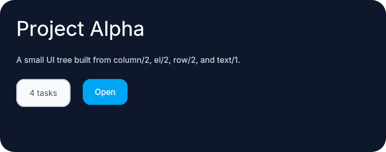
This small tree uses `column/2` as the root, `el/2` for framed content, and
`row/2` for a horizontal action area.
```elixir
column(
[
width(px(380)),
height(fill()),
padding(16),
spacing(14),
Background.color(color(:slate, 900)),
Border.rounded(14)
],
[
el([Font.size(20), Font.color(color(:slate, 50))], text("Project Alpha")),
el(
[Font.color(color(:slate, 300))],
text("A small UI tree built from column/2, el/2, row/2, and text/1.")
),
row([spacing(12)], [
el(
[
padding_xy(12, 8),
Background.color(color(:slate, 50)),
Border.rounded(8),
Border.width(1),
Border.color(color(:slate, 300)),
Font.color(color(:slate, 800))
],
text("4 tasks")
),
el(
[
padding_xy(12, 8),
Background.color(color(:sky, 500)),
Border.rounded(8),
Font.color(color(:slate, 50))
],
text("Open")
)
])
]
)
```
 ## Choosing A Layout
Choose the container that matches the child flow:
- `el/2` when there is exactly one child
- `row/2` when children stay on one horizontal line
- `wrapped_row/2` when horizontal content should wrap onto additional lines
- `column/2` when children stack vertically
- `text_column/2` and `paragraph/2` when the content is prose rather than
generic layout blocks
This comparison shows the difference between `row/2`, `wrapped_row/2`, and
`column/2`.
```elixir
column(
[
width(px(420)),
height(fill()),
padding(16),
spacing(14),
Background.color(color(:slate, 900)),
Border.rounded(14)
],
[
el([Font.size(14), Font.color(color(:slate, 50))], text("row/2 keeps children on one line")),
row([spacing(8)], [
el(
[
padding_xy(10, 6),
Background.color(color(:slate, 50)),
Border.rounded(999),
Border.width(1),
Border.color(color(:slate, 300)),
Font.color(color(:slate, 800))
],
text("One")
),
el(
[
padding_xy(10, 6),
Background.color(color(:slate, 50)),
Border.rounded(999),
Border.width(1),
Border.color(color(:slate, 300)),
Font.color(color(:slate, 800))
],
text("Two")
),
el(
[
padding_xy(10, 6),
Background.color(color(:slate, 50)),
Border.rounded(999),
Border.width(1),
Border.color(color(:slate, 300)),
Font.color(color(:slate, 800))
],
text("Three")
)
]),
el(
[Font.size(14), Font.color(color(:slate, 50))],
text("wrapped_row/2 wraps horizontal content onto new lines")
),
wrapped_row([width(px(320)), spacing_xy(8, 8)], [
el(
[
padding_xy(10, 6),
Background.color(color(:slate, 50)),
Border.rounded(999),
Border.width(1),
Border.color(color(:slate, 300)),
Font.color(color(:slate, 800))
],
text("Docs")
),
el(
[
padding_xy(10, 6),
Background.color(color(:slate, 50)),
Border.rounded(999),
Border.width(1),
Border.color(color(:slate, 300)),
Font.color(color(:slate, 800))
],
text("Layout")
),
el(
[
padding_xy(10, 6),
Background.color(color(:slate, 50)),
Border.rounded(999),
Border.width(1),
Border.color(color(:slate, 300)),
Font.color(color(:slate, 800))
],
text("Nearby")
),
el(
[
padding_xy(10, 6),
Background.color(color(:slate, 50)),
Border.rounded(999),
Border.width(1),
Border.color(color(:slate, 300)),
Font.color(color(:slate, 800))
],
text("Animation")
),
el(
[
padding_xy(10, 6),
Background.color(color(:slate, 50)),
Border.rounded(999),
Border.width(1),
Border.color(color(:slate, 300)),
Font.color(color(:slate, 800))
],
text("Input")
),
el(
[
padding_xy(10, 6),
Background.color(color(:slate, 50)),
Border.rounded(999),
Border.width(1),
Border.color(color(:slate, 300)),
Font.color(color(:slate, 800))
],
text("Scroll")
)
]),
el(
[Font.size(14), Font.color(color(:slate, 50))],
text("column/2 stacks children vertically")
),
column([spacing(8)], [
el(
[
padding(10),
Background.color(color(:slate, 50)),
Border.rounded(10),
Border.width(1),
Border.color(color(:slate, 300)),
Font.color(color(:slate, 800))
],
text("Header")
),
el(
[
padding(10),
Background.color(color(:slate, 100)),
Border.rounded(10),
Border.width(1),
Border.color(color(:slate, 300)),
Font.color(color(:slate, 800))
],
text("Body")
),
el(
[
padding(10),
Background.color(color(:slate, 50)),
Border.rounded(10),
Border.width(1),
Border.color(color(:slate, 300)),
Font.color(color(:slate, 800))
],
text("Footer")
)
])
]
)
```
## Choosing A Layout
Choose the container that matches the child flow:
- `el/2` when there is exactly one child
- `row/2` when children stay on one horizontal line
- `wrapped_row/2` when horizontal content should wrap onto additional lines
- `column/2` when children stack vertically
- `text_column/2` and `paragraph/2` when the content is prose rather than
generic layout blocks
This comparison shows the difference between `row/2`, `wrapped_row/2`, and
`column/2`.
```elixir
column(
[
width(px(420)),
height(fill()),
padding(16),
spacing(14),
Background.color(color(:slate, 900)),
Border.rounded(14)
],
[
el([Font.size(14), Font.color(color(:slate, 50))], text("row/2 keeps children on one line")),
row([spacing(8)], [
el(
[
padding_xy(10, 6),
Background.color(color(:slate, 50)),
Border.rounded(999),
Border.width(1),
Border.color(color(:slate, 300)),
Font.color(color(:slate, 800))
],
text("One")
),
el(
[
padding_xy(10, 6),
Background.color(color(:slate, 50)),
Border.rounded(999),
Border.width(1),
Border.color(color(:slate, 300)),
Font.color(color(:slate, 800))
],
text("Two")
),
el(
[
padding_xy(10, 6),
Background.color(color(:slate, 50)),
Border.rounded(999),
Border.width(1),
Border.color(color(:slate, 300)),
Font.color(color(:slate, 800))
],
text("Three")
)
]),
el(
[Font.size(14), Font.color(color(:slate, 50))],
text("wrapped_row/2 wraps horizontal content onto new lines")
),
wrapped_row([width(px(320)), spacing_xy(8, 8)], [
el(
[
padding_xy(10, 6),
Background.color(color(:slate, 50)),
Border.rounded(999),
Border.width(1),
Border.color(color(:slate, 300)),
Font.color(color(:slate, 800))
],
text("Docs")
),
el(
[
padding_xy(10, 6),
Background.color(color(:slate, 50)),
Border.rounded(999),
Border.width(1),
Border.color(color(:slate, 300)),
Font.color(color(:slate, 800))
],
text("Layout")
),
el(
[
padding_xy(10, 6),
Background.color(color(:slate, 50)),
Border.rounded(999),
Border.width(1),
Border.color(color(:slate, 300)),
Font.color(color(:slate, 800))
],
text("Nearby")
),
el(
[
padding_xy(10, 6),
Background.color(color(:slate, 50)),
Border.rounded(999),
Border.width(1),
Border.color(color(:slate, 300)),
Font.color(color(:slate, 800))
],
text("Animation")
),
el(
[
padding_xy(10, 6),
Background.color(color(:slate, 50)),
Border.rounded(999),
Border.width(1),
Border.color(color(:slate, 300)),
Font.color(color(:slate, 800))
],
text("Input")
),
el(
[
padding_xy(10, 6),
Background.color(color(:slate, 50)),
Border.rounded(999),
Border.width(1),
Border.color(color(:slate, 300)),
Font.color(color(:slate, 800))
],
text("Scroll")
)
]),
el(
[Font.size(14), Font.color(color(:slate, 50))],
text("column/2 stacks children vertically")
),
column([spacing(8)], [
el(
[
padding(10),
Background.color(color(:slate, 50)),
Border.rounded(10),
Border.width(1),
Border.color(color(:slate, 300)),
Font.color(color(:slate, 800))
],
text("Header")
),
el(
[
padding(10),
Background.color(color(:slate, 100)),
Border.rounded(10),
Border.width(1),
Border.color(color(:slate, 300)),
Font.color(color(:slate, 800))
],
text("Body")
),
el(
[
padding(10),
Background.color(color(:slate, 50)),
Border.rounded(10),
Border.width(1),
Border.color(color(:slate, 300)),
Font.color(color(:slate, 800))
],
text("Footer")
)
])
]
)
```
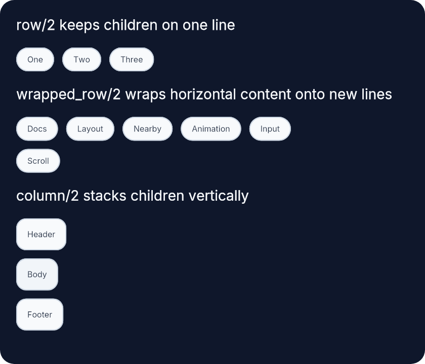 `wrapped_row/2` wraps against the width it resolves from its parent,
including nested fill-driven layouts. Its height grows to match the tallest
child on each wrapped line, so multiline or reflowed children push following
content down instead of clipping. Horizontal child alignment also stays
line-local after wrapping, which means `center_x/0` and `align_right/0`
position children within the remaining width of their wrapped line rather
than across the full container width.
## use Emerge.UI
`use Emerge.UI` imports:
- `Emerge.UI`
- `Emerge.UI.Color`
- `Emerge.UI.Size`
- `Emerge.UI.Space`
- `Emerge.UI.Scroll`
- `Emerge.UI.Align`
It also aliases the grouped helper modules:
- `Animation`
- `Background`
- `Border`
- `Event`
- `Font`
- `Input`
- `Interactive`
- `Nearby`
- `Svg`
- `Transform`
Using `use Emerge` for a viewport also calls `use Emerge.UI`.
## Top-Level Attrs
The root module also defines a small set of attrs that are not grouped into
submodules:
- `key/1` for stable sibling identity
- `focus_on_mount/0` to focus an element on first mount
- `clip_nearby/0` to clip nearby escapes under the host
- `image_fit/1` for `image/2` and `video/2`
```elixir
Input.text([key(:search), focus_on_mount()], state.query)
image([width(px(160)), height(px(96)), image_fit(:cover)], "images/hero.jpg")
```
## Submodules
The rest of the API is organized by concern:
- `Emerge.UI.Color` for named and explicit colors
- `Emerge.UI.Size` for width, height, and length helpers
- `Emerge.UI.Space` for padding and spacing
- `Emerge.UI.Scroll` for scroll-related attrs
- `Emerge.UI.Align` for alignment helpers
- `Emerge.UI.Background`, `Emerge.UI.Border`, and `Emerge.UI.Font` for
decorative styling
- `Emerge.UI.Input`, `Emerge.UI.Event`, and `Emerge.UI.Interactive` for
inputs, event handlers, and interaction styling
- `Emerge.UI.Transform` and `Emerge.UI.Animation` for paint-time movement and
animation
- `Emerge.UI.Nearby` for overlays and attached nearby elements
- `Emerge.UI.Svg` for SVG-specific styling helpers
As trees grow, extract regular Elixir functions that return `Emerge.UI.t()`.
# `attr`
```elixir
@type attr() :: {atom(), term()}
```
A single public UI attribute tuple.
# `attrs`
```elixir
@type attrs() :: [attr()]
```
A list of public UI attribute tuples.
# `child`
```elixir
@type child() :: element()
```
A single child element.
# `children`
```elixir
@type children() :: [child()]
```
A list of child elements.
# `clip_nearby_attr`
```elixir
@type clip_nearby_attr() :: {:clip_nearby, true}
```
# `element`
```elixir
@type element() :: Emerge.Engine.Element.t()
```
An Emerge UI element.
# `focus_on_mount_attr`
```elixir
@type focus_on_mount_attr() :: {:focus_on_mount, true}
```
# `image_fit_attr`
```elixir
@type image_fit_attr() :: {:image_fit, image_fit_mode()}
```
# `image_fit_mode`
```elixir
@type image_fit_mode() :: :contain | :cover
```
Image fit modes accepted by `image_fit/1`.
# `image_source`
```elixir
@type image_source() ::
binary()
| atom()
| {:id, binary()}
| {:path, binary()}
| Emerge.Assets.Ref.t()
```
An image source accepted by `image/2` and `svg/2`.
# `key`
```elixir
@type key() :: term()
```
A stable key used to retain identity among siblings.
# `key_attr`
```elixir
@type key_attr() :: {:key, key()}
```
# `t`
```elixir
@type t() :: element()
```
A tree of UI returned by DSL helpers.
# `video_target`
```elixir
@type video_target() :: EmergeSkia.VideoTarget.t()
```
A video target accepted by `video/2`.
# `__using__`
*macro*
```elixir
@spec __using__(term()) :: Macro.t()
```
Import the root element DSL and the most common UI helper modules.
This imports the core constructors from `Emerge.UI` and the frequently used
helpers from `Color`, `Size`, `Space`, `Scroll`, and `Align`. It also aliases
the grouped styling and behavior modules such as `Background`, `Border`,
`Font`, `Input`, `Event`, and `Nearby`.
# `clip_nearby`
```elixir
@spec clip_nearby() :: clip_nearby_attr()
```
Clip nearby escape overlays attached under this host.
Use this on hosts or scroll containers when nearby content should be clipped
to the host bounds instead of escaping freely.
# `column`
```elixir
@spec column(attrs(), children()) :: t()
```
Lay out children vertically.
Use `column/2` for stacks of content where each child sits below the previous
one.
## Example
```elixir
column([spacing(10)], [
text("Line 1"),
text("Line 2")
])
```
# `el`
```elixir
@spec el(attrs(), child()) :: t()
```
Build a single-child container.
`el/2` is the fundamental framing element. Use it when you need one child and
want to apply styling, alignment, nearby elements, or sizing around that
child.
Font attrs applied to an `el/2` are inherited by text descendants.
## Example
```elixir
el(
[
padding(12),
Background.color(color(:slate, 900)),
Border.rounded(12),
Font.color(color(:slate, 50))
],
text("Hello")
)
```
# `focus_on_mount`
```elixir
@spec focus_on_mount() :: focus_on_mount_attr()
```
Focus this element once when it is first mounted into the tree.
The focus request is tied to first mount, not to every rerender.
# `image`
```elixir
@spec image(attrs(), image_source()) :: t()
```
An image element.
`source` can be a verified `~m"..."` reference, logical asset path,
runtime file path, or `{:id, image_id}`.
Use `image_fit/1` to choose between `:contain` and `:cover`.
## Example
```elixir
image(
[width(px(160)), height(px(96)), image_fit(:cover)],
"images/hero.jpg"
)
```
# `image_fit`
```elixir
@spec image_fit(image_fit_mode()) :: image_fit_attr()
```
Set image fit mode for `image/2` and `video/2`.
- `:contain` keeps the full source visible inside the element bounds
- `:cover` fills the bounds and crops if necessary
# `key`
```elixir
@spec key(key()) :: key_attr()
```
Provide a stable sibling key for identity in lists.
Use `key/1` when sibling order can change and an element should retain its
identity across inserts, removals, or moves.
# `none`
```elixir
@spec none() :: t()
```
Build an empty element that takes up no space.
Use `none/0` for conditional branches that should render nothing.
# `paragraph`
```elixir
@spec paragraph(attrs(), children()) :: t()
```
A paragraph lays out inline text children with word wrapping.
Children should be `text/1` elements or `el/2`-wrapped text elements.
Words flow left-to-right and wrap at the container width.
## Example
```elixir
paragraph([width(px(220))], [
text("A paragraph wraps "),
el([Font.semi_bold()], text("inline")),
text(" text children.")
])
```
# `row`
```elixir
@spec row(attrs(), children()) :: t()
```
Lay out children horizontally in one line.
Use `row/2` when the children should stay on the same horizontal track. Add
`spacing/1` or `space_evenly/0` from `Emerge.UI.Space` to control the gaps.
## Example
```elixir
row([spacing(20)], [
el([], text("A")),
el([], text("B")),
el([], text("C"))
])
```
# `svg`
```elixir
@spec svg(attrs(), image_source()) :: t()
```
An SVG element.
Preserves the SVG's original colors by default. Use `Svg.color/1` to apply
template tinting to all visible pixels.
## Example
```elixir
svg([width(px(24)), height(px(24))], "icons/check.svg")
```
# `text`
```elixir
@spec text(String.t()) :: t()
```
Build a text leaf element.
It can live on its own as a content leaf, but it does not wrap by default.
Use `paragraph/2` or `text_column/2` for wrapped text flows.
## Example
```elixir
text("Status: ready")
```
# `text_column`
```elixir
@spec text_column(attrs(), children()) :: t()
```
A text column lays out paragraph-oriented content vertically.
It behaves like a column but comes with document-friendly defaults:
- `width(fill())`
- `height(content())`
You can override these by passing explicit width/height attributes.
## Example
```elixir
text_column([spacing(12)], [
paragraph([], [text("First paragraph of copy.")]),
paragraph([], [text("Second paragraph of copy.")])
])
```
# `video`
```elixir
@spec video(attrs(), video_target()) :: t()
```
A video element backed by a renderer-owned video target.
`video/2` behaves like an image element whose pixels are provided by an owned
target instead of a file source.
# `wrapped_row`
```elixir
@spec wrapped_row(attrs(), children()) :: t()
```
Lay out children horizontally and wrap onto new lines as needed.
Use `wrapped_row/2` for chips, tags, and other horizontal content that should
continue onto additional lines when it no longer fits the available width.
## Example
```elixir
wrapped_row([spacing_xy(12, 12)], [
el([], text("One")),
el([], text("Two")),
el([], text("Three"))
])
```
---
*Consult [api-reference.md](api-reference.md) for complete listing*
`wrapped_row/2` wraps against the width it resolves from its parent,
including nested fill-driven layouts. Its height grows to match the tallest
child on each wrapped line, so multiline or reflowed children push following
content down instead of clipping. Horizontal child alignment also stays
line-local after wrapping, which means `center_x/0` and `align_right/0`
position children within the remaining width of their wrapped line rather
than across the full container width.
## use Emerge.UI
`use Emerge.UI` imports:
- `Emerge.UI`
- `Emerge.UI.Color`
- `Emerge.UI.Size`
- `Emerge.UI.Space`
- `Emerge.UI.Scroll`
- `Emerge.UI.Align`
It also aliases the grouped helper modules:
- `Animation`
- `Background`
- `Border`
- `Event`
- `Font`
- `Input`
- `Interactive`
- `Nearby`
- `Svg`
- `Transform`
Using `use Emerge` for a viewport also calls `use Emerge.UI`.
## Top-Level Attrs
The root module also defines a small set of attrs that are not grouped into
submodules:
- `key/1` for stable sibling identity
- `focus_on_mount/0` to focus an element on first mount
- `clip_nearby/0` to clip nearby escapes under the host
- `image_fit/1` for `image/2` and `video/2`
```elixir
Input.text([key(:search), focus_on_mount()], state.query)
image([width(px(160)), height(px(96)), image_fit(:cover)], "images/hero.jpg")
```
## Submodules
The rest of the API is organized by concern:
- `Emerge.UI.Color` for named and explicit colors
- `Emerge.UI.Size` for width, height, and length helpers
- `Emerge.UI.Space` for padding and spacing
- `Emerge.UI.Scroll` for scroll-related attrs
- `Emerge.UI.Align` for alignment helpers
- `Emerge.UI.Background`, `Emerge.UI.Border`, and `Emerge.UI.Font` for
decorative styling
- `Emerge.UI.Input`, `Emerge.UI.Event`, and `Emerge.UI.Interactive` for
inputs, event handlers, and interaction styling
- `Emerge.UI.Transform` and `Emerge.UI.Animation` for paint-time movement and
animation
- `Emerge.UI.Nearby` for overlays and attached nearby elements
- `Emerge.UI.Svg` for SVG-specific styling helpers
As trees grow, extract regular Elixir functions that return `Emerge.UI.t()`.
# `attr`
```elixir
@type attr() :: {atom(), term()}
```
A single public UI attribute tuple.
# `attrs`
```elixir
@type attrs() :: [attr()]
```
A list of public UI attribute tuples.
# `child`
```elixir
@type child() :: element()
```
A single child element.
# `children`
```elixir
@type children() :: [child()]
```
A list of child elements.
# `clip_nearby_attr`
```elixir
@type clip_nearby_attr() :: {:clip_nearby, true}
```
# `element`
```elixir
@type element() :: Emerge.Engine.Element.t()
```
An Emerge UI element.
# `focus_on_mount_attr`
```elixir
@type focus_on_mount_attr() :: {:focus_on_mount, true}
```
# `image_fit_attr`
```elixir
@type image_fit_attr() :: {:image_fit, image_fit_mode()}
```
# `image_fit_mode`
```elixir
@type image_fit_mode() :: :contain | :cover
```
Image fit modes accepted by `image_fit/1`.
# `image_source`
```elixir
@type image_source() ::
binary()
| atom()
| {:id, binary()}
| {:path, binary()}
| Emerge.Assets.Ref.t()
```
An image source accepted by `image/2` and `svg/2`.
# `key`
```elixir
@type key() :: term()
```
A stable key used to retain identity among siblings.
# `key_attr`
```elixir
@type key_attr() :: {:key, key()}
```
# `t`
```elixir
@type t() :: element()
```
A tree of UI returned by DSL helpers.
# `video_target`
```elixir
@type video_target() :: EmergeSkia.VideoTarget.t()
```
A video target accepted by `video/2`.
# `__using__`
*macro*
```elixir
@spec __using__(term()) :: Macro.t()
```
Import the root element DSL and the most common UI helper modules.
This imports the core constructors from `Emerge.UI` and the frequently used
helpers from `Color`, `Size`, `Space`, `Scroll`, and `Align`. It also aliases
the grouped styling and behavior modules such as `Background`, `Border`,
`Font`, `Input`, `Event`, and `Nearby`.
# `clip_nearby`
```elixir
@spec clip_nearby() :: clip_nearby_attr()
```
Clip nearby escape overlays attached under this host.
Use this on hosts or scroll containers when nearby content should be clipped
to the host bounds instead of escaping freely.
# `column`
```elixir
@spec column(attrs(), children()) :: t()
```
Lay out children vertically.
Use `column/2` for stacks of content where each child sits below the previous
one.
## Example
```elixir
column([spacing(10)], [
text("Line 1"),
text("Line 2")
])
```
# `el`
```elixir
@spec el(attrs(), child()) :: t()
```
Build a single-child container.
`el/2` is the fundamental framing element. Use it when you need one child and
want to apply styling, alignment, nearby elements, or sizing around that
child.
Font attrs applied to an `el/2` are inherited by text descendants.
## Example
```elixir
el(
[
padding(12),
Background.color(color(:slate, 900)),
Border.rounded(12),
Font.color(color(:slate, 50))
],
text("Hello")
)
```
# `focus_on_mount`
```elixir
@spec focus_on_mount() :: focus_on_mount_attr()
```
Focus this element once when it is first mounted into the tree.
The focus request is tied to first mount, not to every rerender.
# `image`
```elixir
@spec image(attrs(), image_source()) :: t()
```
An image element.
`source` can be a verified `~m"..."` reference, logical asset path,
runtime file path, or `{:id, image_id}`.
Use `image_fit/1` to choose between `:contain` and `:cover`.
## Example
```elixir
image(
[width(px(160)), height(px(96)), image_fit(:cover)],
"images/hero.jpg"
)
```
# `image_fit`
```elixir
@spec image_fit(image_fit_mode()) :: image_fit_attr()
```
Set image fit mode for `image/2` and `video/2`.
- `:contain` keeps the full source visible inside the element bounds
- `:cover` fills the bounds and crops if necessary
# `key`
```elixir
@spec key(key()) :: key_attr()
```
Provide a stable sibling key for identity in lists.
Use `key/1` when sibling order can change and an element should retain its
identity across inserts, removals, or moves.
# `none`
```elixir
@spec none() :: t()
```
Build an empty element that takes up no space.
Use `none/0` for conditional branches that should render nothing.
# `paragraph`
```elixir
@spec paragraph(attrs(), children()) :: t()
```
A paragraph lays out inline text children with word wrapping.
Children should be `text/1` elements or `el/2`-wrapped text elements.
Words flow left-to-right and wrap at the container width.
## Example
```elixir
paragraph([width(px(220))], [
text("A paragraph wraps "),
el([Font.semi_bold()], text("inline")),
text(" text children.")
])
```
# `row`
```elixir
@spec row(attrs(), children()) :: t()
```
Lay out children horizontally in one line.
Use `row/2` when the children should stay on the same horizontal track. Add
`spacing/1` or `space_evenly/0` from `Emerge.UI.Space` to control the gaps.
## Example
```elixir
row([spacing(20)], [
el([], text("A")),
el([], text("B")),
el([], text("C"))
])
```
# `svg`
```elixir
@spec svg(attrs(), image_source()) :: t()
```
An SVG element.
Preserves the SVG's original colors by default. Use `Svg.color/1` to apply
template tinting to all visible pixels.
## Example
```elixir
svg([width(px(24)), height(px(24))], "icons/check.svg")
```
# `text`
```elixir
@spec text(String.t()) :: t()
```
Build a text leaf element.
It can live on its own as a content leaf, but it does not wrap by default.
Use `paragraph/2` or `text_column/2` for wrapped text flows.
## Example
```elixir
text("Status: ready")
```
# `text_column`
```elixir
@spec text_column(attrs(), children()) :: t()
```
A text column lays out paragraph-oriented content vertically.
It behaves like a column but comes with document-friendly defaults:
- `width(fill())`
- `height(content())`
You can override these by passing explicit width/height attributes.
## Example
```elixir
text_column([spacing(12)], [
paragraph([], [text("First paragraph of copy.")]),
paragraph([], [text("Second paragraph of copy.")])
])
```
# `video`
```elixir
@spec video(attrs(), video_target()) :: t()
```
A video element backed by a renderer-owned video target.
`video/2` behaves like an image element whose pixels are provided by an owned
target instead of a file source.
# `wrapped_row`
```elixir
@spec wrapped_row(attrs(), children()) :: t()
```
Lay out children horizontally and wrap onto new lines as needed.
Use `wrapped_row/2` for chips, tags, and other horizontal content that should
continue onto additional lines when it no longer fits the available width.
## Example
```elixir
wrapped_row([spacing_xy(12, 12)], [
el([], text("One")),
el([], text("Two")),
el([], text("Three"))
])
```
---
*Consult [api-reference.md](api-reference.md) for complete listing*