View Source Nostrum.Struct.Component behaviour (Nostrum v0.10.4)
Components are a framework for adding interactive elements to the messages your app or bot sends. They're accessible, customizable, and easy to use. There are several different types of components; this documentation will outline the basics of this new framework and each example.
Components have been broken out into individual modules for easy distinction between them and to separate helper functions and individual type checking between component types - especially as more components are added by Discord.
Each of the components are provided all of the valid types through this module to avoid repetition and allow new components to be added quicker and easier.
Action Row
An Action Row is a non-interactive container component for other types of components. It has a type: 1 and a sub-array of components of other types.
- You can have up to 5 Action Rows per message
- An Action Row cannot contain another Action Row
- An Action Row containing buttons cannot also contain a select menu
Buttons
Buttons are interactive components that render on messages. They have a type: 2, They can be clicked by users. Buttons in Nostrum are further separated into two types, detailed below. Only the Interaction Button will fire a Nostrum.Struct.Interaction when pressed.
- Buttons must exist inside an Action Row
- An Action Row can contain up to 5 buttons
- An Action Row containing buttons cannot also contain a select menu
For more information check out the Discord API Button Styles for more information.
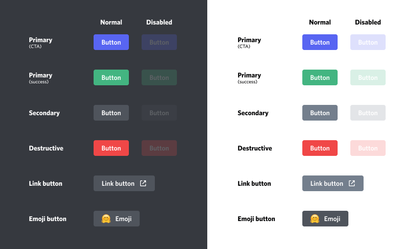
Link Buttons
- Link buttons do not send an
interactionto your app when clicked - Link buttons must have a
url, and cannot have acustom_id - Link buttons will always use
style: 5
Link style: 5

Interaction Buttons ( Non-link Buttons )
Discord calls these buttons "Non-link Buttons" due to the fact that they do not contain a url. However it would be more accurate to call them an "Interaction Button" as they do fire an interaction when clicked which is far more useful for your applications interactivity. As such they are referred to as "Interaction Button" throughout the rest of this module.
- Interaction buttons must have a
custom_id, and cannot have aurl - Can have one of the below
:styleapplied.
Primary style: 1

Secondary style: 2
Success style: 3

Danger style: 4

🐼 Emoji Buttons
Note: The discord documentation and marketing material in relation to buttons indicates that there are three kinds of buttons: 🐼 Emoji Buttons, Link Buttons & Non-Link Buttons. When in fact all buttons can contain an emoji. Because of this reason 🐼 Emoji Buttons are not included as a separate type. Emojis will be instead handled by the two included ( superior ) button types.
The field requirements are already becoming convoluted especially considering everything so far is all still a "Component". Using the sub types and helper functions will ensure all of the rules are followed when creating components.
Select Menu
Select menus are another interactive component that renders on messages. On desktop, clicking on a select menu opens a dropdown-style UI; on mobile, tapping a select menu opens up a half-sheet with the options.
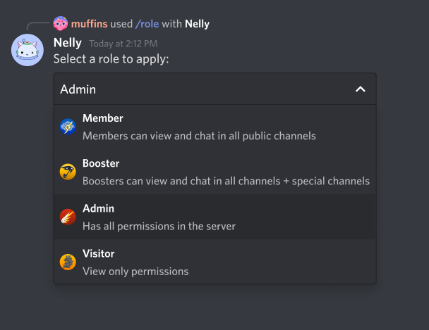
Select menus support single-select and multi-select behavior, meaning you can prompt a user to choose just one item from a list, or multiple. When a user finishes making their choice by clicking out of the dropdown or closing the half-sheet, your app will receive an interaction.
- Select menus must be sent inside an Action Row
- An Action Row can contain only one select menu
- An Action Row containing a select menu cannot also contain buttons
Text Input
Text inputs are an interactive component that render on modals. They can be used to collect short-form or long-form text.
- Text inputs must be sent inside an Action Row
- An Action Row can contain only one text input
- An Action Row containing a text input cannot also contain buttons or a select menu
Can be used to collect short-form or long-form text.
- For short-form text, use
style: 1 - For long-form text, use
style: 2
Text inputs are only allowed to be sent as part of an Interaction response that opens a MODAL.
Summary
Types
A list of components to place inside an action row.
Used to identify the component when the interaction is sent to you from the user.
Indicates if the component is disabled or not.
A partial emoji to display on the object.
A string that appears on the button, max 80 characters.
The maximum length of the text input. Minimum value 1, max 4000.
The maximum number of permitted selections. Minimum value 0, max 25.
The minimum length of the text input. Minimum value 0, max 4000.
The minimum number of permitted selections. Minimum value 0, max 25.
A list of options for select menus, max 25.
Placeholder text if nothing is selected, max 100 characters
Indicates if the text input is required.
Indicates the style.
The currently valid component types.
The type of component.
A url for link buttons.
A pre-filled value for the text input, max 4000 characters.
Callbacks
Create a component from the given keyword list of options
Updates a component with the parameters provided.
Types
@type channel_types() :: [Nostrum.Struct.Channel.type()]
@type components() :: [
  Nostrum.Struct.Component.SelectMenu.t()
  | Nostrum.Struct.Component.Button.t()
  | nil
]
A list of components to place inside an action row.
Due to constraints of action rows, this can either be a list of up to five buttons, a single select menu, or a single text input.
Valid for Action Row.
@type custom_id() :: String.t() | nil
Used to identify the component when the interaction is sent to you from the user.
Valid for Interaction Buttons, Select Menus, and Text Input.
@type default_values() :: [Nostrum.Struct.Component.DefaultValue.t()]
@type disabled() :: boolean() | nil
Indicates if the component is disabled or not.
Valid for Buttons & Select Menus.
@type emoji() ::
  %{
    id: Nostrum.Struct.Emoji.id(),
    name: Nostrum.Struct.Emoji.name(),
    animated: Nostrum.Struct.Emoji.animated()
  }
  | nil
A partial emoji to display on the object.
Valid for Buttons
@type label() :: String.t() | nil
A string that appears on the button, max 80 characters.
Valid for Buttons
@type max_length() :: integer() | nil
The maximum length of the text input. Minimum value 1, max 4000.
Valid for Text Input.
@type max_values() :: integer() | nil
The maximum number of permitted selections. Minimum value 0, max 25.
Valid for Select Menus.
@type min_length() :: integer() | nil
The minimum length of the text input. Minimum value 0, max 4000.
Valid for Text Input.
@type min_values() :: integer() | nil
The minimum number of permitted selections. Minimum value 0, max 25.
Valid for Select Menus.
@type options() :: [Nostrum.Struct.Component.Option.t()] | nil
A list of options for select menus, max 25.
Valid for Select Menus.
@type placeholder() :: String.t() | nil
Placeholder text if nothing is selected, max 100 characters
Valid for Select Menus and Text Input.
@type required() :: boolean() | nil
Indicates if the text input is required.
Valid for Text Input.
@type style() :: integer() | nil
Indicates the style.
You can use one of the Nostrum.Constants.ButtonStyle methods.
Valid for Valid for Interaction Buttons and Text Input.
@type t() ::
  Nostrum.Struct.Component.ActionRow.t()
  | Nostrum.Struct.Component.Button.t()
  | Nostrum.Struct.Component.SelectMenu.t()
  | Nostrum.Struct.Component.TextInput.t()
The currently valid component types.
@type type() :: integer()
The type of component.
Valid for All Types.
| Component Types | |
|---|---|
1 | Action Row |
2 | Button |
3 | SelectMenu |
4 | TextInput |
You can use one of the Nostrum.Constants.ComponentType methods.
Check out the Discord API Message Component Types for more information.
@type url() :: String.t() | nil
A url for link buttons.
Valid for: Buttons
@type value() :: String.t() | nil
A pre-filled value for the text input, max 4000 characters.
Valid for Text Input.
Callbacks
Create a component from the given keyword list of options
Note: While using this function directly, you are not guaranteed to produce a valid component and it is the responsibility of the user to ensure they are passing a valid combination of component attributes. eg. if you pass a button component both a
custom_id, and aurl, the component is invalid as only one of these fields is allowed.
Updates a component with the parameters provided.
Note: While using this function directly, you are not guaranteed to produce a valid component and it is the responsibility of the user to ensure they are passing a valid combination of component attributes. eg. if you pass a button component both a
custom_id, and aurl, the component is invalid as only one of these fields is allowed.