A Guide to Color Palettes
Copy MarkdownThis guide explains how and why Color.Palette generates palettes the way it does, the research and industry practice behind each choice, and — most importantly — which algorithm to reach for given the problem in front of you.
What a palette actually is
In everyday speech, a "palette" is just "a collection of colours that go together". In a design system, the word carries more structure. A palette is a named, parameterised, programmatically-regenerable set of colours derived from a small number of inputs, shaped so that the resulting colours fit into the roles that a UI framework expects — backgrounds, text, borders, interactive states, status indicators, and so on.
That definition carries three consequences that drive every choice below:
- Palettes are derived, not curated. A good palette is computed from a seed. If you swap the seed, the whole palette regenerates consistently. You don't pick each shade by eye.
- Palettes serve roles. A shade isn't just "shade #7 of blue" — it's "the colour used for default body text on a light surface". Different palette algorithms are optimised for different role structures.
- Palettes have to cope with the gamut. The sRGB cube is small. Many mathematically ideal palettes fall partly outside it and have to be gamut-mapped before they're usable on a screen.
Background: why perceptually uniform spaces matter
Early palette tools (including most 2010-era CSS preprocessors) built tonal scales by varying L in HSL. This produces visibly wrong results. HSL's lightness coordinate is perceptually lumpy: a 10% lightness step around yellow looks enormous, while a 10% step around blue is barely visible. Scales look uneven. Mid-tones of warm hues appear washed out while cool mid-tones look fine. The whole palette feels inconsistent.
The fix, adopted more or less simultaneously across the industry in the early 2020s, is to generate palettes in a perceptually uniform space — one where equal coordinate steps correspond to equal perceived differences:
- CIE Lab / LCh — the original attempt (1976). Better than sRGB for lightness, but the hue spacing is still not uniform; shifts in the blue-purple region are famously off.
- Oklab / Oklch — Björn Ottosson's 2020 refinement. Fixed most of Lab's remaining issues. Now the de facto standard for web palette generation: Tailwind v4, Radix Colors, Culori, and most modern design-system tooling operate in Oklch.
- CAM16 / HCT — Material Design 3's choice. More rigorous than Oklab (it models chromatic adaptation and viewing conditions), at the cost of more math and a harder-to-inspect representation. Produces results very close to Oklch for typical sRGB content.
Color.Palette works in Oklch. This matches the majority of modern web tooling, is simple to inspect and debug, and gives indistinguishable results from HCT for the content volumes a design system actually handles.
The three algorithms
After surveying the major design systems (Material Design 3, Tailwind, Radix Colors, Adobe Leonardo, IBM Carbon, Open Color, Atlassian ADG) and tooling libraries (chroma.js, culori, material-color-utilities), palette generation clusters into a small number of recognisable patterns. Color.Palette ships the three that cover the vast majority of web use cases.
1. Tonal scale — Color.Palette.Tonal
What it does. From one seed colour, produce N shades of that hue spread from light to dark along a perceptually uniform curve. This is what Tailwind's blue-50 through blue-950 are. It is the single most commonly requested palette shape in modern CSS, and it's what every design-token tool ultimately speaks.
How it's built.
- Convert the seed to Oklch.
- Sweep lightness
Lacross the stops, from a light anchor (near-white, e.g.0.98) to a dark anchor (near-black, e.g.0.15). - Damp the chroma at the extremes with a
sin(π · L)curve. This is the critical move. Light tints near white and dark shades near black cannot carry as much chroma as a mid-tone — they fall outside sRGB, look muddy, or blow past the gamut. Damping them back to zero atL = 0andL = 1is what makes modern scales look polished instead of looking like someone lerped in HSL. - Optionally apply a small hue drift — warm toward yellow at the light end, cool toward blue at the dark end. This matches how the human visual system perceives lightness (the Hunt effect) and is what gives Radix and the newer Tailwind scales their slightly "natural" feel. Off by default.
- Snap-to-seed. Find the generated stop whose lightness is closest to the seed, and replace that stop with the seed itself. This means if a designer hands you a brand colour that's expected to live at step 500, step 500 really is exactly that colour — not an algorithmic approximation a few ΔE away.
- Gamut-map each stop into sRGB via the CSS Color 4 binary-search algorithm (already implemented in
Color.Gamut).
When to use it.
- You need a Tailwind-style scale:
bg-primary-50,bg-primary-100, …,bg-primary-950. - You have one brand colour and you need ten shades of it.
- You're building a component library and you want to expose exactly one design token per shade.
- You're matching an existing design system's step numbering (50/100/…/950 is near-universal now).
When it's the wrong choice.
- You need to handle more than one seed at a time — use
Color.Palette.theme/2so you get a coordinated set of scales instead of N independent ones that might clash. - You need specific contrast guarantees on each step — Tonal gives you visually even lightnesses, which is not the same as contrastually even shades. Use
Color.Palette.contrast/2.
2. Theme — Color.Palette.Theme
What it does. From one seed, produce a complete design-system theme: five coordinated tonal scales covering every role a UI framework needs — primary, secondary, tertiary, neutral, and neutral-variant — plus a mapping from Material Design 3's symbolic role tokens (:primary, :on_primary, :surface, :outline, etc.) to specific stops in those scales.
This is the algorithm behind Google's Material Design 3 and its Material You dynamic theming. The whole point is that one input colour becomes ~65 output colours that are internally consistent: no matter which pair you juxtapose, they always look like they belong to the same theme.
How it's built.
- The primary scale is a Tonal scale of the seed — its hue, full chroma.
- The secondary scale is the same hue, chroma reduced (default ⅓). It's a muted sibling, used for less-prominent accents and supporting UI.
- The tertiary scale is the hue rotated (default +60°) at full chroma. It's a complementary accent, used for secondary brand moments, highlights, and contrast-of-theme situations.
- The neutral scale is the seed's hue at very low chroma (default 0.02 in Oklch). This isn't pure grey — it's a slightly tinted grey that matches the theme. Used for surfaces, backgrounds, and body text.
- The neutral-variant scale is the same hue at slightly higher chroma (default 0.04). Used for outlines and dividers — things that need to be visible but not loud.
- Each of the five scales uses Material 3's 13-stop tone system (
[0, 10, 20, …, 90, 95, 99, 100]) so thatTheme.role(theme, :primary)(= primary 40) andTheme.role(theme, :on_primary)(= primary 100) are guaranteed to contrast correctly. Theme.role/3takes a:schemeoption (:lightor:dark) that flips which tone each role maps to, so the same theme struct serves both schemes.
When to use it.
- You're building a complete application or design system and you need more than one accent colour.
- You want to support light and dark modes from a single configuration.
- You want Material-style role tokens —
on_primary_container,surface_variant,outline— ready to plug into CSS custom properties. - You're implementing dynamic theming (user picks a seed, the whole app re-colours).
When it's the wrong choice.
- You only need one accent colour — Theme generates four extras you'll never use. Reach for
tonal/2instead. - Your design system has its own role vocabulary that isn't Material's — you can still use Theme as an engine, but you'll be adapting its output rather than consuming it directly.
- You need stops at specific contrast ratios — the Material tone numbers (0..100) are a tone-space convention, not a contrast-space convention. Use
contrast/2.
3. Contrast-targeted — Color.Palette.Contrast
What it does. From a seed, a background colour, and a list of target contrast ratios, produce shades that hit those contrast targets exactly against the background.
This is what Adobe's Leonardo tool does, and it is increasingly how accessibility-conscious design systems generate component-state colours. The core insight: "visually even" lightness steps (what Tonal produces) are not the same as "contrastually even" steps. If your brand blue is at L ≈ 0.5 and you need a variant that contrasts exactly 4.5:1 against white for AA-compliant body text, Tonal won't hand you one — Contrast will.
How it's built.
- Convert the seed to Oklch. Hold hue and chroma.
- For each target contrast ratio, binary search over Oklch
L ∈ [0, 1]. Contrast is monotonic in lightness (for a fixed hue and chroma against a fixed background), so 24 iterations converge to sub-0.01 precision. - Probe both directions (lighter than background, darker than background) and keep the one that reaches the target.
- If the seed's hue + chroma simply cannot reach the requested ratio — e.g. you asked for 21:1 against white with a seed that has significant chroma — the stop is flagged as
:unreachablerather than silently returning the nearest available value. Honest failure is a feature here. - Gamut-map each generated stop into sRGB.
Contrast supports two metrics:
:wcag— WCAG 2.x contrast ratios, typically in[1.0, 21.0]. The default targets are[1.25, 1.5, 2.0, 3.0, 4.5, 7.0, 10.0, 15.0], covering "barely visible" through AAA large text.:apca— APCA W3 0.1.9 Lc values (a perception-based metric being considered for WCAG 3). Targets typically in[15, 108]. Defaults are[15, 30, 45, 60, 75, 90].
When to use it.
- You need component states — resting, hover, active, focus, disabled — that all meet a specific contrast requirement.
- You're generating text shades that must pass AA (4.5:1) or AAA (7:1) on a known surface.
- You're auditing an existing palette and you want to know whether each step actually hits the ratio it claims to.
- You're implementing APCA-driven typography where Lc values are the design vocabulary.
When it's the wrong choice.
- You want a visually uniform appearance — contrast-targeted scales look uneven because they are optimising for a different variable. Lightness jumps between steps will vary.
- You don't have a fixed background — a contrast-targeted scale is only meaningful against the specific surface it was generated for.
- You're designing for print, packaging, or any medium where the final viewing conditions aren't known. Contrast metrics assume screen rendering.
Choosing an algorithm
Start with what kind of answer you need:
| You need… | Use |
|---|---|
| Ten shades of my brand blue, keyed 50–950 | tonal/2 |
| A complete light/dark theme from one seed | theme/2 |
| Component states that pass AA against white | contrast/2 with metric: :wcag |
| Text hierarchy driven by APCA Lc values | contrast/2 with metric: :apca |
| Many accent colours that look like siblings | theme/2 and use :primary, :secondary, :tertiary |
| The exact stops Tailwind produces for a custom hue | tonal/2 |
| Colour-picker tool output | tonal/2 per user input |
| Status / semantic colours (success, warning, error, info) that match a brand seed | Color.Palette.semantic/3 → tonal/2 |
| Dynamic theming based on a hero image's dominant colour | theme/2 (extract dominant, feed as seed) |
If you're not sure, the decision tree is:
- Do you need more than one seed? Yes →
theme/2. No → continue. - Do the stops need to guarantee contrast against a known background? Yes →
contrast/2. No →tonal/2.
The fourth algorithm: contrast-constrained tonal scales
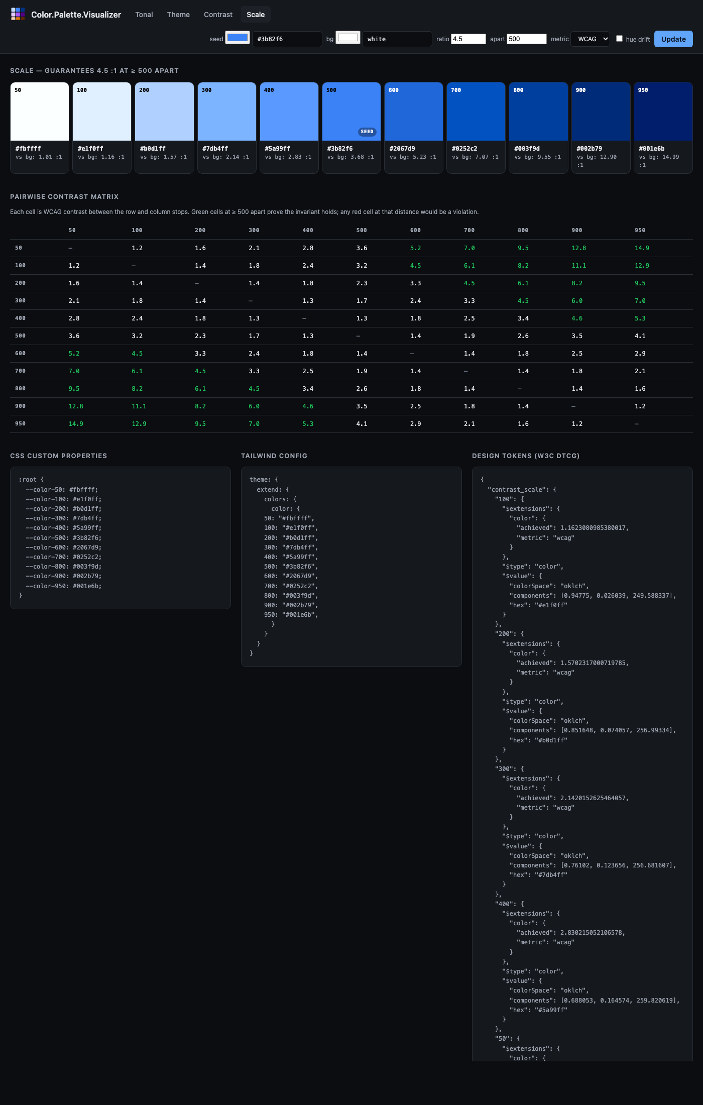
A fourth algorithm sits between tonal/2 and contrast/2 — the hybrid described by Matt Ström-Awn in Generating colour palettes with math. Implemented in the library as Color.Palette.ContrastScale and exposed via Color.Palette.contrast_scale/2.
What it does. Generates a Tailwind-style numeric scale where any two stops whose labels differ by at least apart are guaranteed to satisfy a minimum contrast ratio. The default guarantee — {4.5, 500} — says any pair of stops ≥ 500 label units apart (e.g. 100 and 600, or 300 and 800) contrasts ≥ 4.5 : 1 against each other. Contrast becomes a structural property of the scale, not a per-stop binary search.
How it's built.
Convert the seed to Oklch. Hold hue and chroma roughly constant.
Let
t = apart / (max_label − min_label)— the fraction of the scale that theapartdistance spans.For each stop at normalised position
p ∈ [0, 1], compute its target contrast against the background:C(p) = ratio ^ (p / t). The lightest stop starts at contrast 1 (equal to the background); the darkest atratio ^ (1/t).Binary-search Oklch lightness for a colour that achieves
C(p)against the background.Because contrast(i, j) = C_j / C_i for stops on the same side of the background, the pairwise invariant falls out: any two stops whose positions differ by
≥ tcontrast by at leastratio.
Usage.
# Default guarantee: any two stops ≥ 500 apart pass 4.5:1
scale = Color.Palette.contrast_scale("#3b82f6")

# Any two stops ≥ 300 apart pass 3:1
scale = Color.Palette.contrast_scale("#3b82f6", guarantee: {3.0, 300})

# Works against any background — same invariant, different anchoring
dark_scale = Color.Palette.contrast_scale("#3b82f6", background: "black")

# APCA targets
apca = Color.Palette.contrast_scale("#3b82f6",
  metric: :apca,
  guarantee: {60.0, 500}
)
When to reach for it.
You want a Tailwind-style numeric scale and you want pairwise contrast guarantees baked in.
You want light and dark modes to follow the same contrast rules by construction — regenerate with a different
:backgroundand the invariant holds on both.You're done auditing palette pairs after the fact.
When one of the other three is better.
You want component states tied to specific ratios (resting 3:1, focus 4.5:1, disabled 1.3:1) — use
contrast/2, which lets you name individual targets.You want maximum visual smoothness between adjacent stops with no accessibility requirement — use
tonal/2, which optimises for even lightness instead of even contrast.You want a full theme across five coordinated sub-palettes — use
theme/2.
Relation to the paper. Ström-Awn's paper also describes a saturation parabola S(n) = −4n² + 4n and a Bezold-Brücke hue drift H(n) = H_base + 5(1 − n). These are available here as respectively our Oklch sin(π · L) chroma damping (applied by Color.Gamut) and the hue_drift: true option on ContrastScale (which uses the paper's exact formula).
Practical notes
Picking a seed
- Both
tonal/2andtheme/2snap the seed to the nearest stop, so the seed is preserved exactly. If you need it at a specific stop (always 500, say), generate first and then checkpalette.seed_stop— if it's not where you want, nudge the seed's lightness. - Mid-tone seeds (Oklch L around 0.55–0.65) produce the most balanced scales. Very light or very dark seeds will produce scales where most of the action is on one side of the seed.
Chroma
- Over-saturated seeds (e.g. CSS
red,lime) produce scales where the light and mid tints look fine but the dark end has to gamut-map aggressively. The chroma damping mostly hides this, but don't expect Radix-level polish unless you choose your seed carefully. - Low-chroma seeds produce near-neutral scales. This is a legitimate use case (greys tinted by brand), not a bug.
Hue drift
- Default off in
tonal/2. Turn it on (hue_drift: true) when you want a more "designed" feel at the cost of a harder-to-predict output. - Don't turn it on inside
theme/2— you'll end up with scales that drift in different directions and the theme cohesion suffers.
Unreachable contrast targets
- When
contrast/2returns:unreachable, the correct response is usually to lower the target or accept a larger seed deviation. Don't silently substitute a close-enough colour — it defeats the purpose of the algorithm. - Highly-saturated seeds reach lower maximum contrasts than near-neutral seeds. If you need very high contrast (> 15:1), consider using a near-neutral seed and placing the brand colour at a lower-contrast stop where it's still usable.
Gamut mapping
- All three algorithms gamut-map into sRGB by default. If you're targeting Display P3 or Rec. 2020, pass
gamut: :P3orgamut: :Rec2020and the extra chroma headroom will be used automatically. - Gamut mapping uses the CSS Color 4 Oklch binary-search method, which preserves hue and lightness at the cost of reducing chroma. This is almost always the right trade.
Worked example
Building a tokenised theme for a light/dark web app from a single brand colour:
brand = "#3b82f6"

theme = Color.Palette.theme(brand)

# CSS custom properties for light scheme
css = """
:root {
  --primary: #{Color.to_hex(Color.Palette.Theme.role(theme, :primary) |> elem(1))};
  --on-primary: #{Color.to_hex(Color.Palette.Theme.role(theme, :on_primary) |> elem(1))};
  --surface: #{Color.to_hex(Color.Palette.Theme.role(theme, :surface) |> elem(1))};
  --on-surface: #{Color.to_hex(Color.Palette.Theme.role(theme, :on_surface) |> elem(1))};
  --outline: #{Color.to_hex(Color.Palette.Theme.role(theme, :outline) |> elem(1))};
}

[data-theme="dark"] {
  --primary: #{Color.to_hex(Color.Palette.Theme.role(theme, :primary, scheme: :dark) |> elem(1))};
  --on-primary: #{Color.to_hex(Color.Palette.Theme.role(theme, :on_primary, scheme: :dark) |> elem(1))};
  --surface: #{Color.to_hex(Color.Palette.Theme.role(theme, :surface, scheme: :dark) |> elem(1))};
  --on-surface: #{Color.to_hex(Color.Palette.Theme.role(theme, :on_surface, scheme: :dark) |> elem(1))};
  --outline: #{Color.to_hex(Color.Palette.Theme.role(theme, :outline, scheme: :dark) |> elem(1))};
}
"""
Changing brand regenerates the entire theme. Swap it to "#ec4899" and you have a pink app; swap it to "#059669" and you have a green app; the role structure and contrast relationships are unchanged.
Design tokens (W3C DTCG)
All three palette types export to the W3C Design Tokens Community Group color format (2025.10 draft), so palettes can be consumed by Style Dictionary, Figma, Penpot, and any other tool that speaks DTCG.
palette = Color.Palette.tonal("#3b82f6", name: "blue")

tokens = Color.Palette.Tonal.to_tokens(palette)
# => %{
#      "blue" => %{
#        "500" => %{"$type" => "color", "$value" => %{"colorSpace" => "oklch", ...}},
#        ...
#      }
#    }

json = :json.encode(tokens) |> IO.iodata_to_binary()
File.write!("tokens.json", json)
Themes export the five sub-palettes under "palette" plus Material 3 role tokens as DTCG aliases pointing at the underlying stops — tools that resolve aliases get both the raw palette and the semantic role vocabulary:
theme = Color.Palette.theme("#3b82f6")
tokens = Color.Palette.Theme.to_tokens(theme, scheme: :light)

tokens["palette"]["primary"]["40"]
# => %{"$type" => "color", "$value" => %{"colorSpace" => "oklch", ...}}

tokens["role"]["primary"]
# => %{"$type" => "color", "$value" => "{palette.primary.40}"}
Contrast palettes emit one token per target. Unreachable stops are preserved with a null $value and an $extensions.color.reason field, so consumers can distinguish "excluded by filter" from "mathematically impossible".
The Color.DesignTokens module handles the low-level encode/decode for individual colours across all 14 DTCG-supported colour spaces — see its docs for the full list.
Default encoding space is Oklch (richest information, no gamut loss), with a "hex" fallback always present for tools that don't yet grok Oklab / Oklch. Override via the :space option to to_tokens/2 for narrower toolchains.
Alias resolution is out of scope for v1 — the decoder returns :alias_not_resolved if you hand it a "{palette.blue.500}" string. Resolve aliases in the caller where you have the full token tree.
Modes (DTCG's light/dark bundling) are not yet emitted. For now, call Theme.to_tokens/2 with scheme: :light and scheme: :dark and save two files.
Aside: the library's own logo
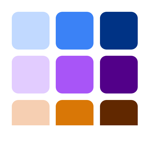
The logo you see on hexdocs and GitHub was produced by this library. It's a 3×3 grid of nine swatches — three hues (blue, violet, amber) across three tones (light, mid, dark) — all generated by Color.Palette.Tonal.
The generator code is essentially this:
seeds = ["#3b82f6", "#a855f7", "#d97706"]
stops = [300, 500, 700]

for seed <- seeds do
  Color.Palette.tonal(seed,
    stops: stops,
    light_anchor: 0.88,
    dark_anchor: 0.35
  )
end
That produces the nine hex values. An HTML page with a CSS grid renders them at 512×512, and headless Chrome takes a screenshot. No external design tool, no hand-picked colours, no Figma file. The logo is literally output from the library applied to itself.
A few things worth noting from doing this:
- Narrow anchors matter. The defaults (
light_anchor: 0.98, dark_anchor: 0.15) produced near-white and near-black swatches at the 300 and 700 stops — technically correct but visually dim. Tightening to0.88/0.35kept every swatch clearly in its hue family. - Seed lightness shows up. The amber was originally
#f59e0b, which has Oklch lightness around 0.78. With the tightened anchors, that's already past the lightest stop, so the snap-to-seed behaviour landed the seed at position 300 and pushed the "mid" and "dark" stops much darker than the other rows. Swapping to#d97706(L ≈ 0.62) — a visually comparable amber — put it at the centre stop instead and the three rows came out balanced. This is exactly the caveat the Picking a seed section above warns about, caught in our own dogfood. - Chroma damping did its job invisibly. None of the nine swatches needed gamut clipping; the
sin(π·L)damping inColor.Palette.Tonalkept every stop safely inside sRGB without us having to think about it.
The whole process — write guides/palettes.md, realise we need a logo, generate it with the library, save it, commit — was a small end-to-end demo of why Color.Palette exists. Turns out the best way to verify a palette library is to use it on your own artefacts.
Further reading
- Ottosson, B. (2020). A perceptual color space for image processing. The Oklab paper.
- Google (2021). Material Design 3: Color system. The source of the role tokens.
- Stefanov, L. (2022). Radix Colors. Detailed write-up on hue drift, chroma at the extremes, and designer-curated tone curves.
- Adobe (2021). Leonardo. The original contrast-targeted palette generator.
- Ström-Awn, M. (2024). Generating colour palettes with math. Describes a contrast-invariant tonal scale built in OKHsl — the hybrid approach discussed above, with a nicely-motivated derivation of the saturation parabola, the Bezold-Brücke hue drift, and the contrast-integrated lightness function.
- Somers, A. (2024). APCA contrast. Perception-based contrast metric.