Using the Palette Visualizer
Copy MarkdownColor.Palette.Visualizer is a small Plug-based web UI for previewing the palettes produced by Color.Palette. It runs standalone during development or mounts inside an existing Phoenix / Plug app. Every input lives in the URL — share a URL and you've shared the palette.
The visualizer is modelled on three widely-referenced sites, one per palette algorithm — UI Colors for Tonal, Material Theme Builder for Theme, and Adobe Leonardo for Contrast. The Scale tab covers the fourth algorithm — contrast-constrained tonal scales, inspired by Matt Ström-Awn's Generating colour palettes with math. See the palette guide for background on the four algorithms themselves.
Install and run
The visualizer is opt-in. The core color library has zero runtime dependencies; pulling in plug and bandit is only required if you actually use the visualizer. Add both to your project's deps:
# mix.exs
def deps do
  [
    {:color, "~> 0.4"},
    {:plug, "~> 1.15"},
    {:bandit, "~> 1.5"}
  ]
end
Standalone (development)
iex -S mix
iex> Color.Palette.Visualizer.Standalone.start(port: 4001)
# {:ok, #PID<0.xxx.0>}
# Open http://localhost:4001
Mounted inside a Phoenix router
# lib/my_app_web/router.ex
forward "/palette", Color.Palette.Visualizer
Mount path is arbitrary. The visualizer reads conn.script_name so links resolve correctly whether mounted at /, /palette, or anywhere else.
Mounted inside a plain Plug pipeline
defmodule MyApp.Router do
  use Plug.Router
  plug :match
  plug :dispatch

  forward "/palette", to: Color.Palette.Visualizer
end
As a supervised child
# For a Phoenix app that wants the visualizer running alongside on a second port
children = [
  # ... other children ...
  {Color.Palette.Visualizer.Standalone, port: 4001}
]
Supervisor.start_link(children, strategy: :one_for_one)
The three views
All three views share one header: a tab bar, a seed input, any view-specific options (hue-drift toggle for Tonal, scheme picker for Theme, metric and background for Contrast), and a submit button. Pages are fully server-rendered HTML — no JavaScript.
The seed input is actually two controls side-by-side: a native <input type="color"> and a free-text field. Click the swatch to open your OS's colour picker; or type rebeccapurple, oklch(0.7 0.15 180), or any other CSS colour syntax in the text field. On submit the server prefers the text field if you changed it (i.e. its value differs from what the picker was initialised to), otherwise it uses the picker's value. The picker pre-fills with the resolved hex of whatever seed is currently in the URL, so ?seed=rebeccapurple opens the picker on #663399.
Tonal — one seed, N shades
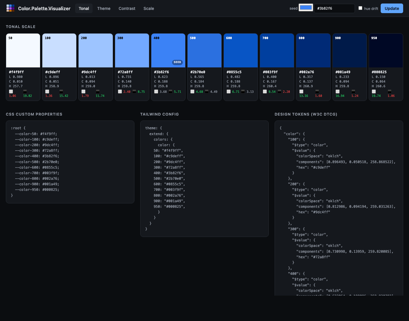
URL. /tonal?seed=%233b82f6&hue_drift=0
What it shows. Eleven swatches (Tailwind's 50–950 stops) laid out in a row. Under each swatch: the hex, the OKLCH coordinates, and a two-cell contrast readout — contrast-against-white and contrast-against-black, coloured green when the ratio passes 4.5:1, amber at 3:1+, red below. The swatch that holds the seed gets a "SEED" badge so you can see exactly where it landed on the scale.
Below the strip: a CSS custom properties block ready to paste into a stylesheet, and a Tailwind config block shaped for theme.extend.colors.
Options.
seed— any valueColor.new/1accepts (hex, CSS named colour,oklch(...), etc.).hue_drift— toggles the Hunt-effect hue drift (warm at the light end, cool at the dark end).
Theme — five coordinated scales + role tokens
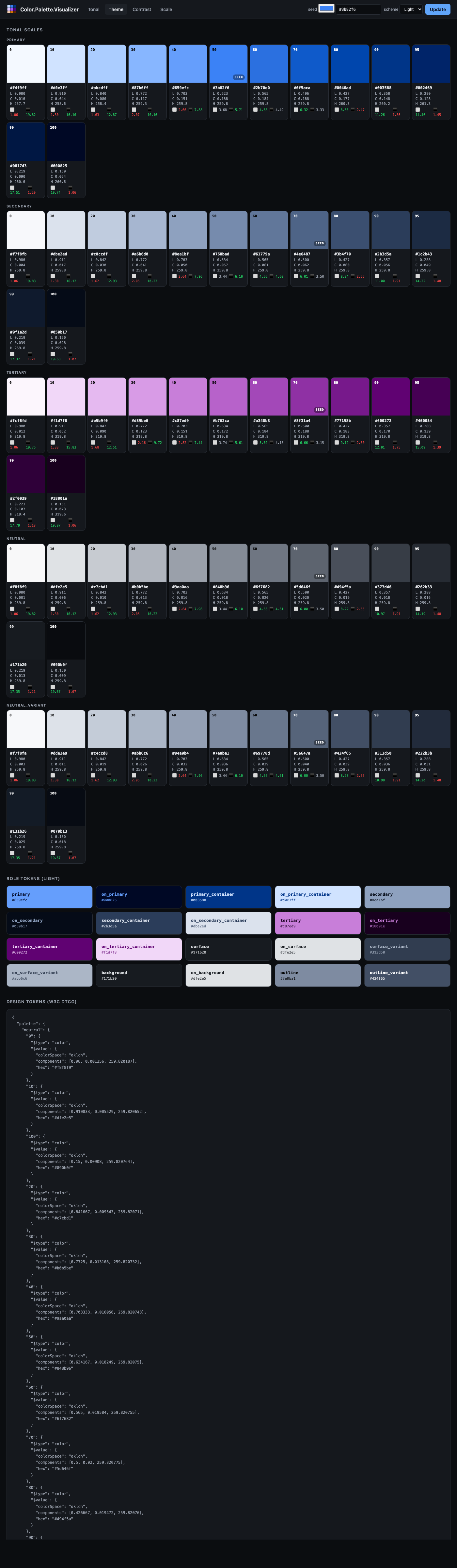
URL. /theme?seed=%233b82f6&scheme=light
What it shows. Five rows, one per sub-palette (primary / secondary / tertiary / neutral / neutral-variant), each showing the full 13-stop Material 3 tone scale. Below those, a grid of every Material 3 role token (primary, on_primary, surface, surface_variant, outline, etc.) rendered as a card — the card's background is the role's colour and the card's text is its paired on_* role so you can see the intended foreground / background pairing together at a glance.
Options.
seed— seed colour.scheme—lightordark. Flips which stop each role maps to (e.g.:primaryis tone 40 in light, tone 80 in dark).
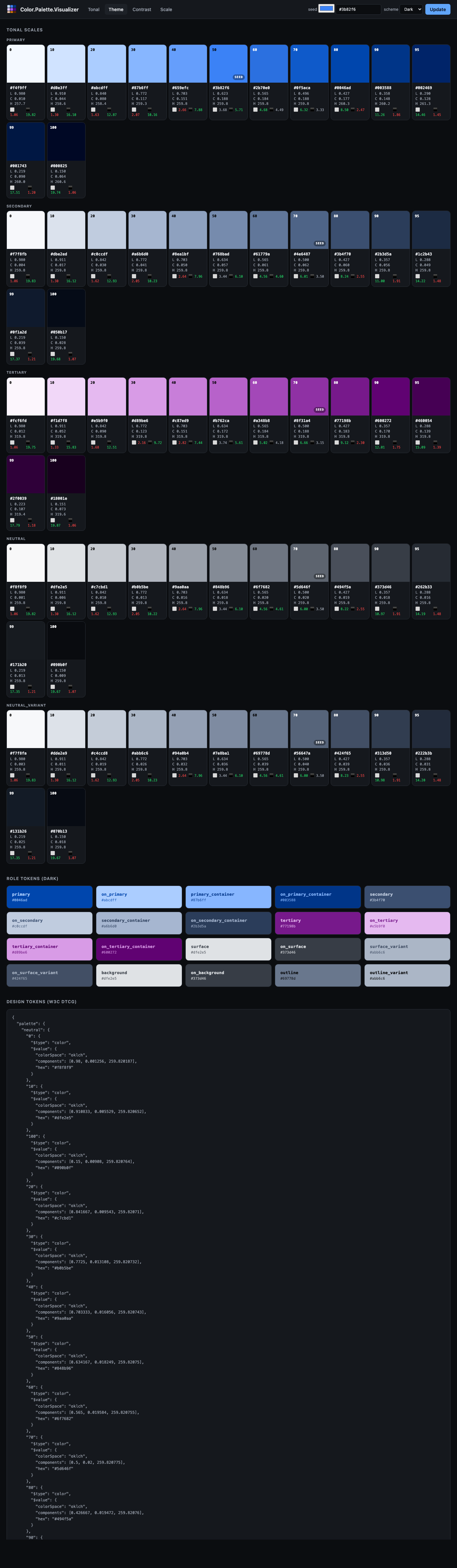
The dark scheme shows the same seed re-applied for a dark-UI theme:
Contrast — target ratios and a pass/fail matrix
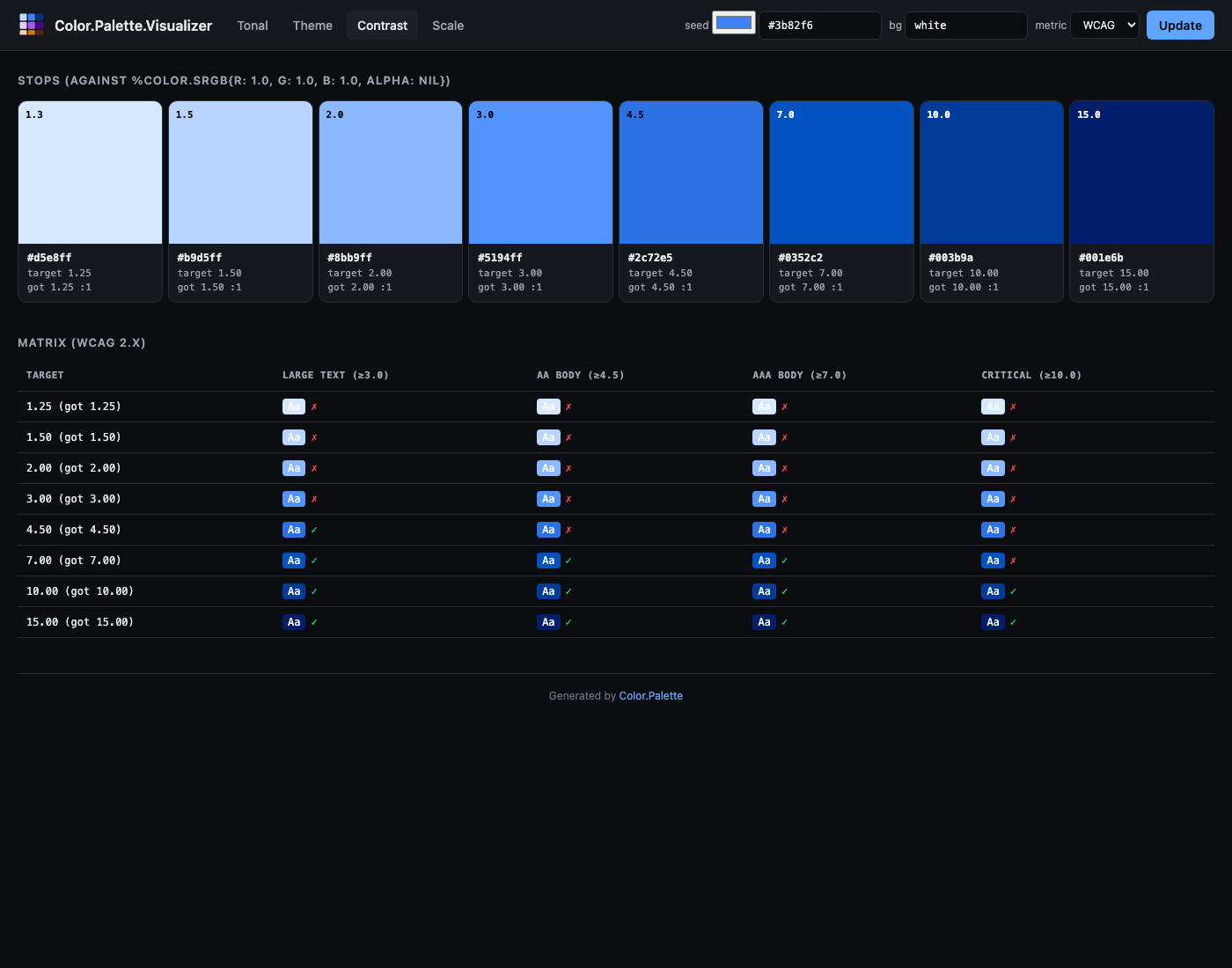
URL. /contrast?seed=%233b82f6&background=white&metric=wcag
What it shows. For each target contrast ratio (WCAG defaults: 1.25, 1.5, 2, 3, 4.5, 7, 10, 15), a swatch whose colour was binary-searched in Oklch lightness until it hits that exact ratio against the chosen background. The target and the ratio actually achieved are both printed on the card so any snap-to-precision drift is visible.
Below the swatches: a matrix. One row per generated stop, one column per common text-size pass threshold (WCAG: Large 3:1, AA 4.5:1, AAA 7:1, Critical 10:1 — APCA: 45, 60, 75, 90). Each cell shows a mini "Aa" preview in the stop colour on the background, plus a ✓ / ✗ for whether that stop passes the column's threshold. Unreachable targets (the seed's hue and chroma physically can't hit the requested ratio against this background) are marked with a struck-through em-dash and left empty rather than silently falling back to something close.
Options.
seed— seed colour.background— the colour to measure contrast against. Defaultwhite; tryblackfor dark-mode planning.metric—wcag(default) orapca.
Gamut — chromaticity diagram
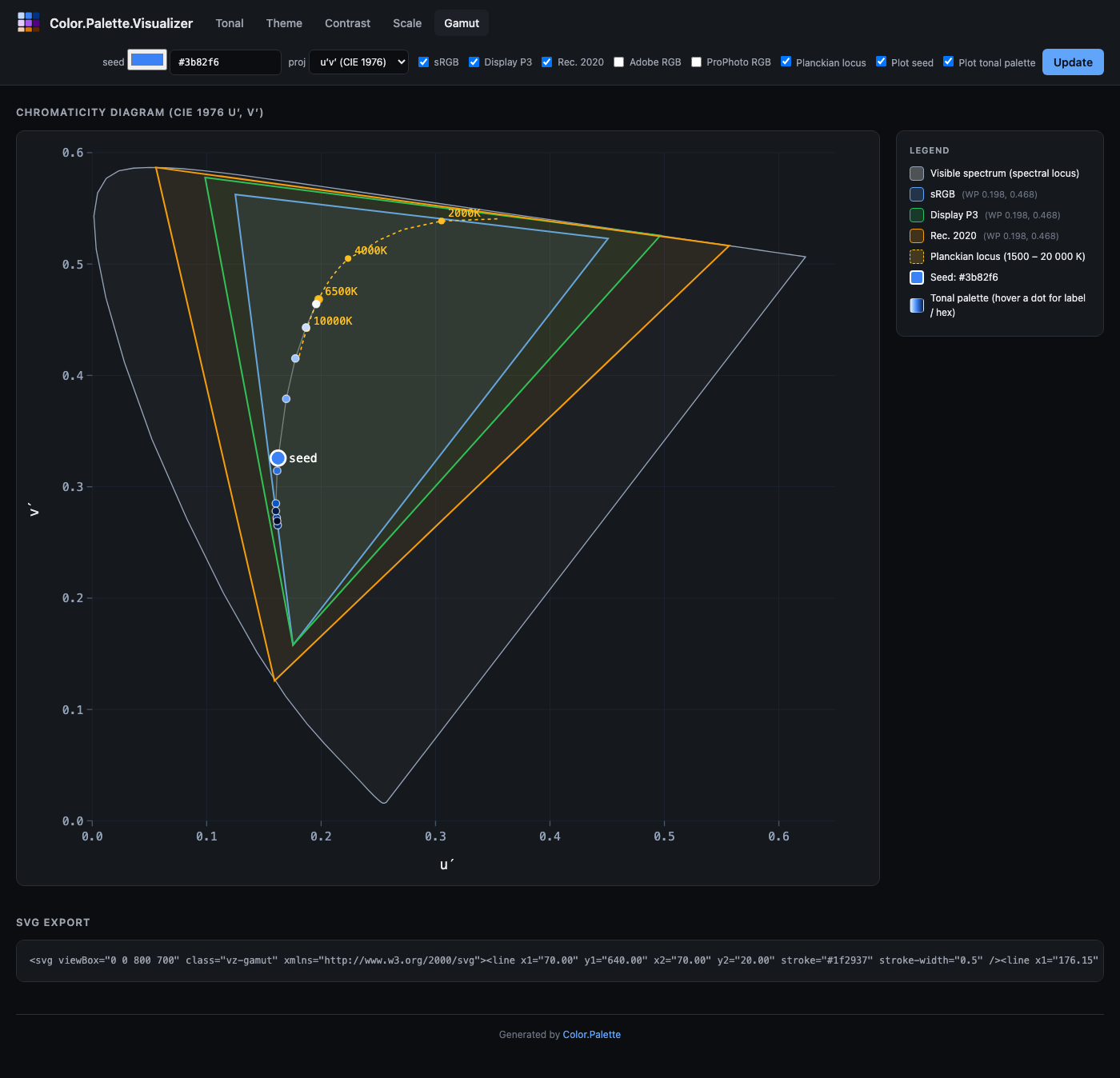
URL. /gamut?projection=uv&gamut[]=SRGB&gamut[]=P3_D65&planckian=1&overlay_seed=1
What it shows. The classic chromaticity horseshoe — the boundary of human-visible colour — with coloured triangles overlaid for each RGB working space. Every triangle's white point is marked with a filled circle in the same colour. Optionally, the Planckian locus (the curve of blackbody chromaticities from 1500 K to 20 000 K) is drawn as a dashed gold line with labelled CCT annotations at 2000, 2700, 4000, 6500, and 10 000 K. The current seed colour is plotted as a white-bordered dot labelled "seed", so you can see which of the working spaces actually contain it.
The legend on the right lists every rendered triangle with its white-point coordinates, and the Planckian and seed overlays when they're active.
Options.
projection—uv(CIE 1976 u′v′, default) orxy(CIE 1931). u′v′ is perceptually more uniform and what modern references use; xy is the textbook default.gamut[]— zero or more ofSRGB,P3_D65,Rec2020,Adobe,ProPhoto. Each renders as an overlaid triangle.planckian— checkbox, toggles the Planckian locus.overlay_seed— checkbox, plots the seed as a large white-bordered dot.overlay_palette— checkbox, plots every stop of the tonal palette generated from the seed as a chain of coloured dots connected by a thin track. Each dot is hoverable for its stop label and hex. Useful for verifying that the entire palette lives inside a target gamut.seed— the colour whose chromaticity to plot.
Below the diagram there's an SVG export block containing the raw SVG markup — copy it straight into a design doc, blog post, or slide deck.
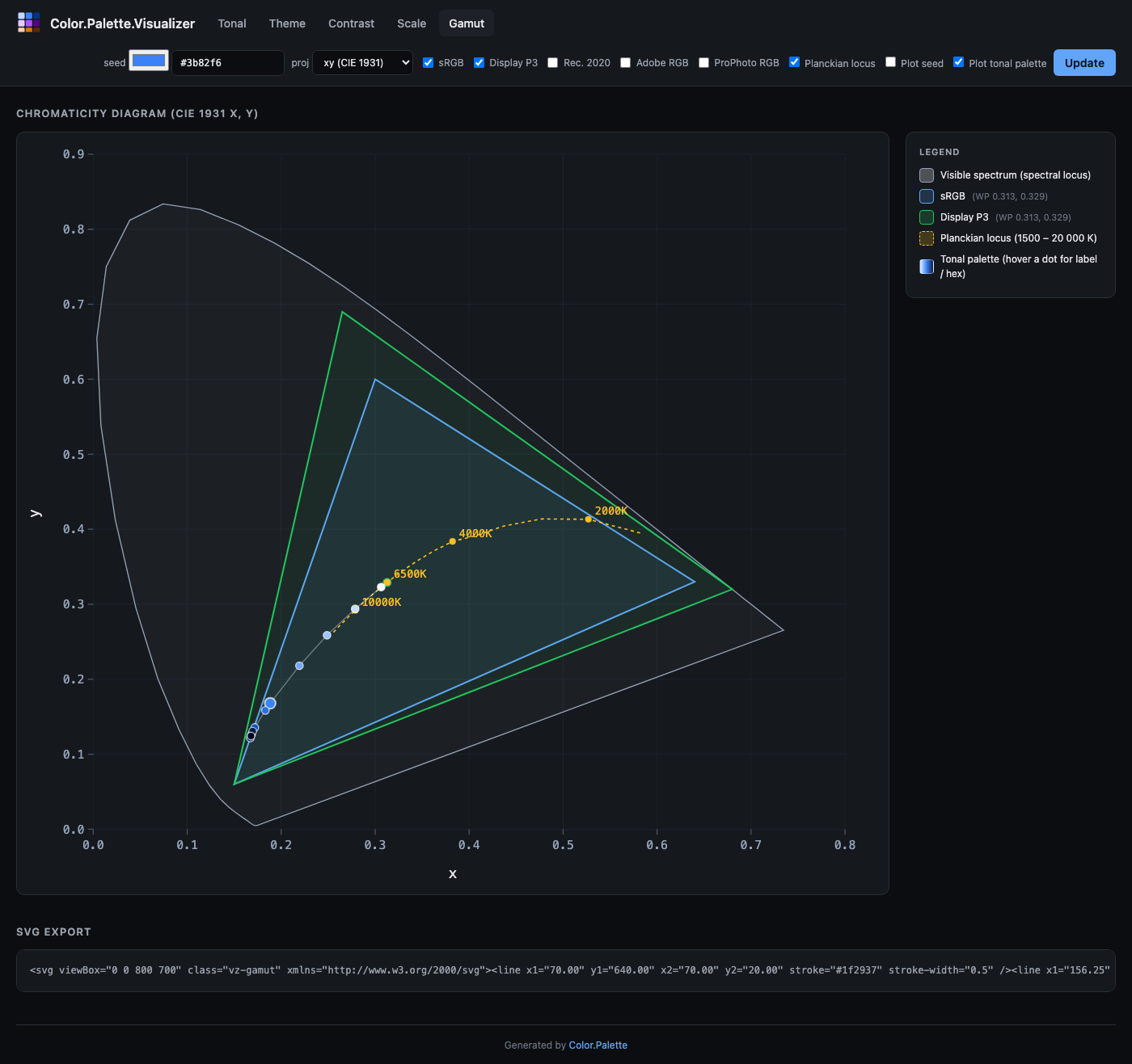
The xy projection looks like this — note how much more green and how much less blue there is compared to u′v′:
Scale — contrast-constrained tonal scale
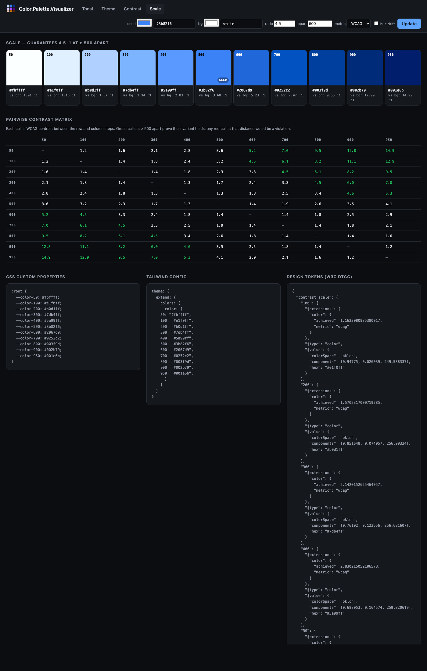
URL. /scale?seed=%233b82f6&background=white&ratio=4.5&apart=500&metric=wcag
What it shows. A Tailwind-style numeric scale (50–950) where any two stops whose labels differ by at least apart are guaranteed to satisfy at least ratio contrast against each other. The header notes the guarantee in plain English ("guarantees 4.5 : 1 at ≥ 500 apart"). Below the scale, a pairwise contrast matrix shows every stop-against-every-stop contrast — green cells at or past the apart threshold confirm the invariant visually, any red cell at that distance would be a violation. The three-column export block at the bottom provides CSS custom properties, Tailwind config, and W3C DTCG Design Tokens (including the achieved-vs-background ratio in each token's $extensions).
Options.
seed— seed colour.background— the colour the contrast is measured against. Defaultwhite.ratio— the contrast threshold that distances ≥apartmust exceed. Default4.5.apart— the minimum label distance that triggers the contrast guarantee. Default500.metric—wcag(default) orapca. For APCA,ratiois interpreted as an Lc value (typical targets 45–90).hue_drift— enables the paper's Bezold-Brücke compensation. Off by default.
Sharing palettes
There's no "save" or "copy link" button because there's no state outside the URL. The current URL in the browser bar is the shareable link. Copy it, paste it in Slack, bookmark it in a design-review doc, embed it in your team's design-tokens repo. Opening the link in any browser reproduces the exact palette bit-for-bit because the server recomputes it from the query string.
Security notes
The visualizer is a development tool. Don't expose it on a public-facing port without thinking about:
- No rate limiting. Each request runs palette generation and gamut mapping. A pathological caller could use it for cheap compute.
- No auth. Everything is publicly readable.
- Query-string input flows into palette constructors. They raise typed
Color.PaletteErrors rather than crash, and the router rescues those into HTML errors — but if you're running it alongside sensitive data you should still mount it behind your app's auth layer or only during dev.
For local dev, Standalone.start/1 binds to :loopback (127.0.0.1) by default, which is fine. Pass ip: :any only if you actually need LAN access.
Customising
Only one decision is intentionally non-configurable: the Material 3 role vocabulary. If you want a different role taxonomy you'll need to render it yourself. The Color.Palette.Visualizer.Render module is internal (marked @moduledoc false) but exposes a tonal_strip/1 helper for reusing the swatch-row markup in your own view if you need it.
Everything else — CSS, chrome, default seed — is a straightforward swap inside the view modules. The visualizer is intentionally small (under 1000 LoC across all six files) so it can be read and modified in an afternoon.
Export formats
The Tonal view emits three copy-ready blocks below the scale:
:root {
  --color-50: #f4f9ff;
  --color-100: #c9deff;
  --color-200: #9dc4ff;
  /* ... */
  --color-950: #000825;
}
theme: {
extend: {
colors: {
color: {
50: "#f4f9ff",
100: "#c9deff",
/* ... */
950: "#000825",
}
}
}
}And a Design Tokens block in W3C DTCG 2025.10 format:
{
  "blue": {
    "500": {
      "$type": "color",
      "$value": {
        "colorSpace": "oklch",
        "components": [0.6231, 0.1881, 259.82],
        "hex": "#3b82f6"
      }
    },
    ...
  }
}
If you pass ?name=brand as a query param (or set name: when calling Color.Palette.Tonal.new/2 directly), the key in all three blocks changes to match.
The Theme view emits a full DTCG token file with both a "palette" group (the five tonal scales) and a "role" group (Material 3 role tokens emitted as DTCG aliases pointing at the scales), so tools that resolve aliases get both the raw palette and the semantic vocabulary.
Related
- Palette guide — the algorithm background and choosing between Tonal, Theme, and Contrast.
Color.Palette— the palette façade API.Color.Palette.Visualizer— the router module docs.