Border styling attributes.
Layout
Border width participates in layout in Emerge.
Content and child layout are inset by the sum of padding and border width on
each side. For an element with padding(10) and Border.width(5), content
starts 15px in from each edge.
For fixed-size elements, the outer size stays the same and border width reduces the inner content area. For content-sized elements, the element grows by the border widths.
Border width can affect layout even when no border is painted. Layout uses
border_width, while painting also requires border_color.
Radius
Border width defaults to 0, so Border.rounded(8) rounds the element
corners but does not draw a visible border by itself.
Rounded corners affect backgrounds and clipping, and also shape the border when width and color are present.
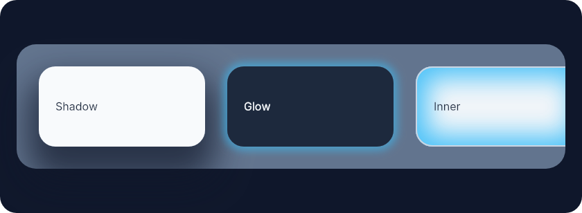
Shadows
shadow/1 and glow/2 create outer shadows. They are decorative and do not
affect layout.
Parent padding does not clip descendant rendering, so outer shadows can bleed into a parent's padding.
Scroll containers clip outer shadows only on active scroll axes: scroll_y
clips top and bottom, scroll_x clips left and right. If both axes scroll,
the full scrollport clips the shadow, including rounded corners.
inner_shadow/1 renders inside the element and does not bleed outside it.
Examples
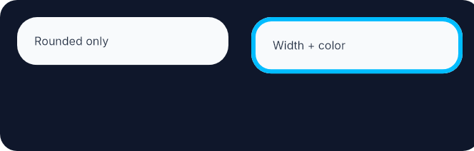
Rounded corners shape the element even before a visible border is added. Adding width and color then paints the border on that same outline.
row(
  [
    height(fill()),
    spacing(16),
    padding(12),
    Background.color(color(:slate, 900)),
    Border.rounded(12)
  ],
  [
    el(
      [
        width(px(148)),
        padding(12),
        Background.color(color(:slate, 50)),
        Font.color(color(:slate, 800)),
        Border.rounded(14)
      ],
      text("Rounded only")
    ),
    el(
      [
        width(px(148)),
        padding(12),
        Background.color(color(:slate, 50)),
        Border.rounded(14),
        Border.width(3),
        Border.color(color(:sky, 400)),
        Font.color(color(:slate, 800))
      ],
      text("Width + color")
    )
  ]
)
Shadows are easiest to understand side by side: outer shadow bleeds outward, glow is a zero-offset shadow, and inner shadow stays inside the element.
el(
  [
    width(fill()),
    height(fill()),
    padding(12),
    Background.color(color(:slate, 900)),
    Border.rounded(12),
    center_y()
  ],
  row(
    [
      width(fill()),
      padding(16),
      spacing(16),
      Background.color(color(:slate, 500)),
      Border.rounded(14)
    ],
    [
      el(
        [
          width(px(120)),
          height(px(58)),
          padding(12),
          Background.color(color(:slate, 50)),
          Border.rounded(12),
          Border.shadow(offset: {0, 16}, size: 8, blur: 24, color: color_rgba(15, 23, 42, 0.7)),
          center_y(),
          Font.color(color(:slate, 800))
        ],
        text("Shadow")
      ),
      el(
        [
          width(px(120)),
          height(px(58)),
          padding(12),
          Background.color(color(:slate, 800)),
          Border.rounded(12),
          Border.glow(color_rgba(56, 189, 248, 0.55), 3),
          center_y(),
          Font.color(color(:slate, 50))
        ],
        text("Glow")
      ),
      el(
        [
          width(px(120)),
          height(px(58)),
          padding(12),
          Background.color(color(:slate, 100)),
          Border.rounded(12),
          Border.width(1),
          Border.color(color(:slate, 300)),
          Border.inner_shadow(
            offset: {0, 0},
            size: 8,
            blur: 18,
            color: color_rgba(56, 189, 248, 0.9)
          ),
          center_y(),
          Font.color(color(:slate, 800))
        ],
        text("Inner")
      )
    ]
  )
)
Summary
Functions
Set border color
Dashed border style
Dotted border style
Add a uniform glow around the element.
Add an inner shadow (inset box shadow).
Round the element corners. This does not draw a visible border unless width and color are also set.
Round each element corner individually. This does not draw a visible border unless width and color are also set.
Add an outer box shadow.
Solid border style (default)
Set border width. Border width participates in layout and reduces the content area.
Set per-edge border widths (top, right, bottom, left). These widths participate in layout on their respective sides.
Types
@type color_value() :: Emerge.UI.Color.color() | Emerge.UI.Color.t()
@type shadow_options() :: keyword()
@type style() :: :solid | :dashed | :dotted
@type t() ::
  {:border_radius, radius()}
  | {:border_width, width_value()}
  | {:border_color, color_value()}
  | {:border_style, style()}
  | {:box_shadow, shadow_value()}
Functions
@spec color(color_value()) :: {:border_color, color_value()}
Set border color
@spec dashed() :: {:border_style, :dashed}
Dashed border style
@spec dotted() :: {:border_style, :dotted}
Dotted border style
@spec glow(color_value(), number()) :: {:box_shadow, shadow_value()}
Add a uniform glow around the element.
Sugar for shadow/1 with zero offset.
Decorative only. glow/2 follows the same bleed and scroll-axis clipping
behavior as outer shadows.
@spec inner_shadow(shadow_options()) :: {:box_shadow, shadow_value()}
Add an inner shadow (inset box shadow).
Same options as shadow/1 but rendered inside the element.
Decorative only. Inner shadows do not affect layout and stay inside the element.
Round the element corners. This does not draw a visible border unless width and color are also set.
Round each element corner individually. This does not draw a visible border unless width and color are also set.
@spec shadow(shadow_options()) :: {:box_shadow, shadow_value()}
Add an outer box shadow.
Decorative only. Outer shadows do not affect layout.
Parent padding does not clip descendant rendering, so outer shadows can bleed into a parent's padding.
Scroll containers clip outer shadows only on active scroll axes.
Options:
:offset-{x, y}offset (default{0, 0}):size- spread size in pixels (default0):blur- blur radius in pixels (default10):color- shadow color (default:black)
@spec solid() :: {:border_style, :solid}
Solid border style (default)
@spec width(width_value()) :: {:border_width, width_value()}
Set border width. Border width participates in layout and reduces the content area.
@spec width_each(number(), number(), number(), number()) ::
  {:border_width, width_value()}
Set per-edge border widths (top, right, bottom, left). These widths participate in layout on their respective sides.