
PhiaUI
829 production-ready Phoenix LiveView components — the most complete UI library in the Elixir ecosystem.
PhiaUI is a copy-paste component library for Phoenix LiveView, inspired by shadcn/ui. Components are ejected directly into your project — you own the code, customise every detail, and never fight a black-box abstraction. Built on TailwindCSS v4 semantic tokens, every component ships with full WAI-ARIA accessibility, zero heavy npm runtime dependencies, and first-class dark mode out of the box.

Why PhiaUI?
| Feature | PhiaUI | Salad UI | Mishka Chelekom | Doggo | Primer Live | shadcn/ui |
|---|---|---|---|---|---|---|
| Platform | Phoenix LiveView | Phoenix LiveView | Phoenix LiveView | Phoenix LiveView | Phoenix LiveView | React |
| Components | 829 | ~40 | ~100 | ~40 | ~45 | ~50 |
| Copy-paste ownership | ✅ | ✅ | ✅ | ✅ | ❌ | ✅ |
LiveView-native (phx-*, streams) | ✅ | ✅ | ✅ | ✅ | ✅ | ❌ |
| Zero npm runtime deps | ✅ | ✅ | ✅ | ✅ | Partial | ❌ |
| Full WAI-ARIA on all interactive | ✅ | Partial | Partial | ✅ | Partial | ✅ |
| TailwindCSS v4 | ✅ | Partial | ✅ | ❌ | ❌ | Partial |
| Dark mode | ✅ | ✅ | ✅ | ✅ | ✅ | ✅ |
| Responsive-first | ✅ | ❌ | ❌ | ❌ | ❌ | Partial |
| Container queries | ✅ | ❌ | ❌ | ❌ | ❌ | ❌ |
| Calendar & date/time suite | ✅ (33) | ❌ | Partial | ❌ | ❌ | Partial |
| Charts (SVG, zero-JS) | ✅ (19 types) | ❌ | ❌ | ❌ | ❌ | ❌ |
| Data Grid (sorting, pinning, export) | ✅ | ❌ | ❌ | ❌ | ❌ | ❌ |
| Drag & Drop | ✅ | ❌ | ❌ | ❌ | ❌ | ❌ |
| Rich text / code editors | ✅ | ❌ | ❌ | ❌ | ❌ | ❌ |
| Background patterns & animations | ✅ (37) | ❌ | ❌ | ❌ | ❌ | Partial |
Ecto FormField auto-integration | ✅ | Partial | ✅ | ✅ | ✅ | N/A |
| LiveBook tutorial | ✅ | ❌ | ❌ | ❌ | ❌ | N/A |
Philosophy: Launch First, Then Improve
PhiaUI is built on a simple principle: ship fast, iterate based on real usage.
- Copy-paste ownership means you own every line of code. No waiting for upstream PRs. No dependency lock-in. Fork a component, change it, ship it.
- 829 components built in weeks, not months. Speed comes from convention over configuration, consistent patterns, and relentless focus on what developers actually need.
- Every component works today. They render, they handle events, they integrate with Ecto forms, they respect dark mode and accessibility. Are they all perfect? No. Are they all useful? Yes.
- Community-driven improvement cycle. Use a component, find a rough edge, submit a PR. The bar for contribution is low: if you make it better, it ships.
"Perfect is the enemy of good." — Ship your app with PhiaUI today. Improve the components as you go.
See it in action
PhiaUI-samples — 16 complete Phoenix LiveView demo apps built entirely with PhiaUI components.
Quick Start
1. Add dependency
# mix.exs
def deps do
  [
    {:phia_ui, "~> 0.1.17"}
  ]
end
mix deps.get
2. Install assets
mix phia.install
This copies all component .ex files into lib/your_app_web/components/ui/, JS hooks into assets/js/phia_hooks/, and the CSS theme into assets/css/.
3. Configure CSS
In assets/css/app.css:
@import "../../deps/phia_ui/priv/static/theme.css";In assets/js/app.js, register hooks:
import { PhiaHooks } from "./phia_hooks"

let liveSocket = new LiveSocket("/live", Socket, {
  hooks: { ...PhiaHooks, ...YourHooks }
})
4. Use components
Import in your LiveView or layout module and start rendering:
defmodule MyAppWeb.PageLive do
  use MyAppWeb, :live_view
  import PhiaUi.Components.Buttons
  import PhiaUi.Components.Feedback
  import PhiaUi.Components.Inputs
end
<.button variant="default" phx-click="save">Save changes</.button>
<.alert variant="success">Saved successfully!</.alert>
<.input type="text" name="email" label="Email" placeholder="you@example.com" />Component Catalog
829 components across 20+ categories. Click any category for full API docs and examples.
| Category | Count | Key Components |
|---|---|---|
| Animation | 22 | marquee, typewriter, particle_bg, orbit, aurora, confetti_burst |
| Background | 15 | gradient_mesh, noise_bg, dot_grid, bokeh_bg, wave_bg, retro_grid |
| Buttons | ~20 | button, toggle, split_button, icon_button, social_button, gradient_button |
| Calendar | 33 | date/time pickers, booking_calendar, big_calendar, streak_calendar |
| Cards | 22 | stat_card, article_card, profile_card, pricing_card, product_card |
| Charts & Data | ~80 | 35+ chart types, data_grid, data_table, trees, kanban_board |
| Collaboration | ~35 | presence, cursors, comments, threads, notifications, version_history |
| Display | 27 | icon, badge, avatar, timeline, utilities, avatar_group |
| Editor | ~170 | rich_editor, 10 presets, blocks, media, formatting, track_changes |
| Feedback | 21 | alert, banner, snackbar, loading_overlay, skeleton, error_display |
| Forms | 34 | form_section, form_fieldset, radio_card, cascader, signature_pad |
| Inputs | 61 | text, rich, OTP, upload, textarea variants, emoji_picker |
| Interaction | 14 | sortable_list, sortable_grid, drag_handle, drop_zone, draggable_tree |
| Layout | 31 | box, flex, grid, stack, shell, responsive_stack, container_query |
| Media | 5 | audio_player, carousel, image_comparison, qr_code, watermark |
| Navigation | 33 | sidebar, breadcrumb, tabs, command_palette, toc, stepper_nav |
| Overlay | 9 | dialog, drawer, sheet, dropdown_menu, popover, tooltip |
| Surface | 25 | glass_card, bento_grid, border_beam, card_spotlight, bottom_sheet |
| Typography | 18 | heading, prose, code_block, gradient_text, blockquote |
Charts Tutorial
PhiaUI includes 19 chart types — all pure SVG rendered server-side, zero JavaScript required. Charts animate with CSS, respect prefers-reduced-motion, and work with Phoenix LiveView's real-time updates out of the box.
Quick start — bar chart in 3 lines
<.bar_chart
  id="revenue"
  series={[%{name: "Revenue", data: [120, 200, 150, 80, 250, 190]}]}
  categories={["Jan", "Feb", "Mar", "Apr", "May", "Jun"]}
/>
Data format
All charts accept a consistent data format:
# Single series
series = [%{name: "Sales", data: [10, 20, 30, 40]}]

# Multi-series (grouped/stacked)
series = [
  %{name: "Desktop", data: [120, 200, 150, 80]},
  %{name: "Mobile", data: [90, 140, 110, 60]}
]

# Categories (x-axis labels)
categories = ["Q1", "Q2", "Q3", "Q4"]
Chart types overview
<%!-- Bar charts: vertical, horizontal, grouped, stacked --%>
<.bar_chart id="bar" series={@series} categories={@categories} />
<.bar_chart id="bar-h" series={@series} categories={@categories} orientation={:horizontal} />
<.bar_chart id="bar-s" series={@series} categories={@categories} stacked={true} />

<%!-- Line charts: linear, smooth, monotone, step curves --%>
<.line_chart id="line" series={@series} categories={@categories} />
<.line_chart id="smooth" series={@series} categories={@categories} curve={:smooth} />
<.line_chart id="step" series={@series} categories={@categories} curve={:step_after} />

<%!-- Area charts: filled regions, stackable --%>
<.area_chart id="area" series={@series} categories={@categories} />
<.area_chart id="stacked" series={@series} categories={@categories} stacked={true} />

<%!-- Pie & donut --%>
<.pie_chart id="pie" data={[%{label: "A", value: 40}, %{label: "B", value: 30}, %{label: "C", value: 30}]} />
<.donut_chart id="donut" data={@pie_data}>
  <:center_label>Total<br/>100</:center_label>
</.donut_chart>

<%!-- Specialized charts --%>
<.radar_chart id="radar" series={@series} categories={@categories} />
<.scatter_chart id="scatter" series={[%{name: "Points", data: [{1,2}, {3,4}, {5,1}]}]} />
<.gauge_chart id="gauge" value={73} max={100} zones={[{0, 40, "red"}, {40, 70, "yellow"}, {70, 100, "green"}]} />
<.heatmap_chart id="heat" series={@heatmap_series} categories={@categories} />
<.waterfall_chart id="waterfall" data={[%{label: "Start", value: 100}, %{label: "Add", value: 50}, %{label: "Sub", value: -30}]} />
<.treemap_chart id="tree" data={[%{label: "A", value: 60}, %{label: "B", value: 30}, %{label: "C", value: 10}]} />
<.sparkline_card id="kpi" title="Revenue" value="$42k" sparkline_data={[10, 25, 18, 30, 42]} />
Customization
<%!-- Custom colors --%>
<.bar_chart id="c1" series={@series} categories={@categories}
  colors={["#6366f1", "#f59e0b", "#10b981"]} />

<%!-- Animation control --%>
<.line_chart id="c2" series={@series} categories={@categories}
  animate={true} animation_duration={800} />

<%!-- Theme overrides --%>
<.bar_chart id="c3" series={@series} categories={@categories}
  theme={%{axis: %{font_size: 14}, grid: %{stroke: "#e5e7eb"}}} />

<%!-- Border radius on bars --%>
<.bar_chart id="c4" series={@series} categories={@categories} border_radius={6} />
Composable charts with xy_chart
Mix bar, line, and area series in a single chart:
<.xy_chart id="mixed" categories={["Jan", "Feb", "Mar", "Apr"]}>
  <:series type={:bar} name="Revenue" data={[120, 200, 150, 250]} />
  <:series type={:line} name="Trend" data={[100, 160, 140, 220]} />
  <:series type={:area} name="Target" data={[150, 150, 150, 150]} />
</.xy_chart>
Responsive charts
Wrap any chart in responsive_chart for automatic aspect-ratio scaling:
<.responsive_chart ratio="16/9">
<.line_chart id="responsive" series={@series} categories={@categories} />
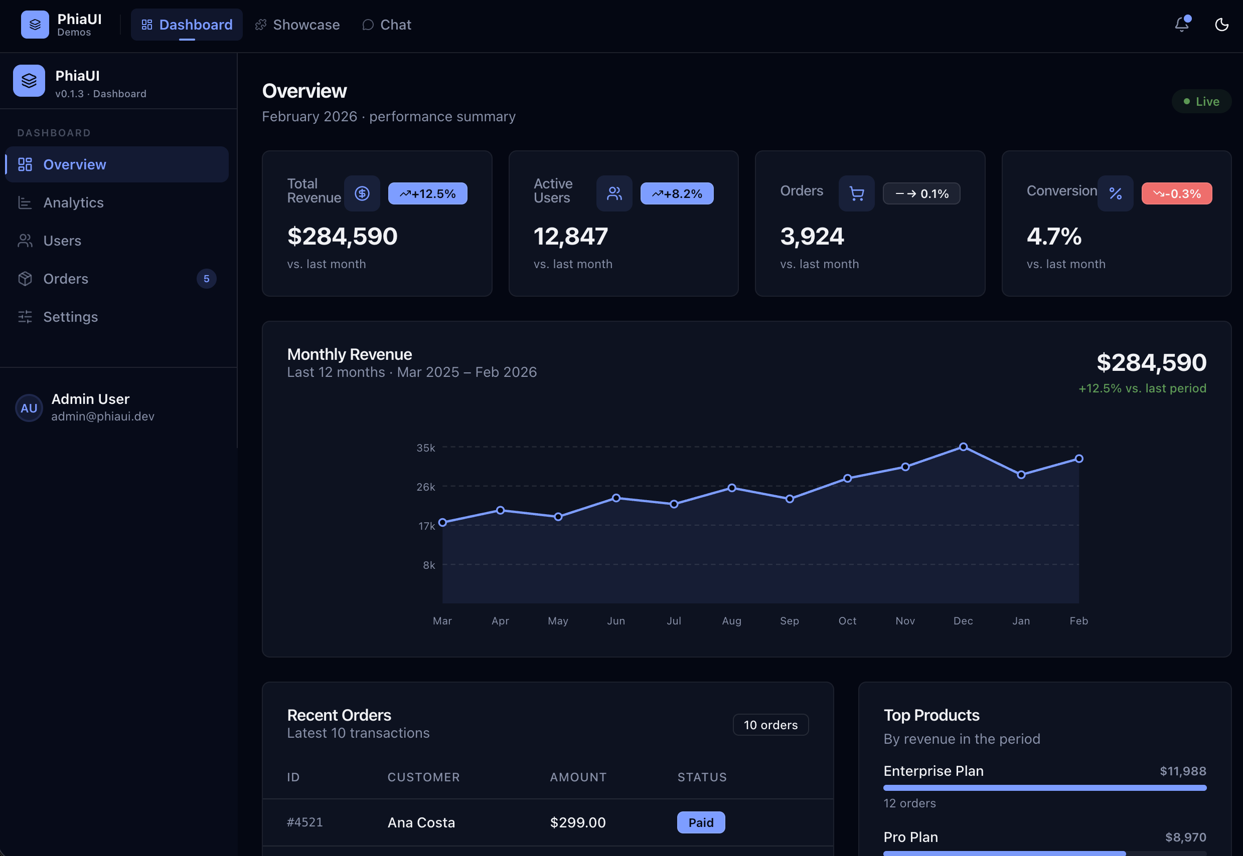
</.responsive_chart>Real-world dashboard example
defmodule MyAppWeb.DashboardLive do
  use MyAppWeb, :live_view
  import PhiaUi.Components.Data
  import PhiaUi.Components.Display

  def render(assigns) do
    ~H"""
    <div class="grid grid-cols-1 md:grid-cols-3 gap-6 mb-8">
      <.stat_card title="Revenue" value="$142k" delta={12.5} delta_type={:increase} />
      <.stat_card title="Users" value="8,420" delta={-2.1} delta_type={:decrease} />
      <.sparkline_card id="orders" title="Orders" value="1,247"
        sparkline_data={[80, 95, 110, 90, 125, 140, 130]} />
    </div>

    <div class="grid grid-cols-1 lg:grid-cols-2 gap-6">
      <.bar_chart id="monthly"
        series={[
          %{name: "Desktop", data: [120, 200, 150, 80, 250, 190]},
          %{name: "Mobile", data: [90, 140, 110, 60, 180, 150]}
        ]}
        categories={["Jan", "Feb", "Mar", "Apr", "May", "Jun"]}
        stacked={true} animate={true} />

      <.donut_chart id="traffic"
        data={[
          %{label: "Direct", value: 40},
          %{label: "Organic", value: 30},
          %{label: "Referral", value: 20},
          %{label: "Social", value: 10}
        ]}>
        <:center_label>Traffic<br/>Sources</:center_label>
      </.donut_chart>
    </div>
    """
  end
end
Rich Editor v2
PhiaUI v0.1.17 includes a full rich text editor system with ~170 editor components across 12 modules, 10 preset editors, and the PhiaEditor v2 JS engine (~1,200 LOC). All editors are composable, server-rendered, and work with Phoenix LiveView out of the box.
5 preset editors — drop-in and ready
<%!-- Notion-style: slash commands, drag handles, block toolbars --%>
<.notion_editor id="notion" name="doc[body]" value={@body} />

<%!-- Google Docs-style: menu bar, A4 pages, track changes --%>
<.google_docs_editor id="gdocs" name="doc[body]" value={@body} />

<%!-- Medium-style: floating toolbar, clean reading experience --%>
<.medium_editor_v2 id="medium" name="post[body]" value={@body} />

<%!-- Developer notes: syntax highlighting, code sandbox, markdown --%>
<.code_notes_editor id="notes" name="note[body]" value={@body} />

<%!-- Full collaboration: presence, cursors, comments sidebar --%>
<.collaborative_editor id="collab" name="doc[body]" value={@body} room_id="doc-123" />
Block types
The editor supports 20+ block types including headings, paragraphs, task lists, callout blocks, collapsible sections, code blocks with syntax highlighting, tables, images with resize handles, equations (KaTeX), diagrams (Mermaid), drawings (canvas), embeds, and more.
<%!-- Build a custom editor with specific blocks --%>
<.rich_editor id="my-editor" name="content[body]" value={@body}>
  <:toolbar>
    <.formatting_toolbar editor_id="my-editor" />
  </:toolbar>
</.rich_editor>
Editor modules
| Module | Components | Description |
|---|---|---|
Editor | 19 | Core toolbar, bubble/floating menus, slash commands |
RichEditor | 6 | Rich editor shell, toolbar, content area |
Blocks | 9 | Task list, callout, collapsible, columns, page break |
MediaBlocks | 8 | Image, table, equation, diagram, drawing, embed |
ContentBlocks | 14 | Toggle list, tabs, video/audio, bookmark, math, PDF |
BlockControls | 4 | Add button, conversion menu, toolbar, drag indicator |
AdvancedBlocks | 5 | Synced block, columns, code sandbox, A4 page |
Formatting | 16 | Bold, italic, underline, strikethrough, highlight, etc. |
Extensions | 10 | Track changes, search/nav, export, AI assistant |
TextDirection | 2 | RTL/LTR toggle, bidirectional text block |
LanguageTools | 4 | Grammar panel, spell check, dictionary |
Presets | 10 | 5 original + 5 v2 preset editors |
Full API docs:
docs/components/editor.md| Tutorial:docs/guides/tutorial-editor.md
Usage Examples
Data table with server-side sorting
defmodule MyAppWeb.UsersLive do
  use MyAppWeb, :live_view
  import PhiaUi.Components.Data

  def mount(_params, _session, socket) do
    {:ok, assign(socket, users: list_users(), sort_key: "name", sort_dir: "asc")}
  end

  def handle_event("sort", %{"key" => key, "dir" => dir}, socket) do
    {:noreply, assign(socket, users: sort_users(key, dir), sort_key: key, sort_dir: dir)}
  end
end
<.data_grid id="users-grid" rows={@users} sort_key={@sort_key} sort_dir={@sort_dir}>
<.data_grid_head sort_key="name" on_sort="sort">Name</.data_grid_head>
<.data_grid_head sort_key="email" on_sort="sort">Email</.data_grid_head>
<.data_grid_head sort_key="role" on_sort="sort">Role</.data_grid_head>
<:row :let={user}>
<.data_grid_cell><%= user.name %></.data_grid_cell>
<.data_grid_cell><%= user.email %></.data_grid_cell>
<.data_grid_cell>
<.badge variant={role_variant(user.role)}><%= user.role %></.badge>
</.data_grid_cell>
</:row>
</.data_grid>Ecto form with validation
defmodule MyAppWeb.ProfileLive do
  use MyAppWeb, :live_view
  import PhiaUi.Components.Inputs
  import PhiaUi.Components.Buttons

  def render(assigns) do
    ~H"""
    <.form for={@form} phx-change="validate" phx-submit="save">
      <.phia_input field={@form[:name]} label="Full name" required />
      <.phia_input field={@form[:email]} type="email" label="Email" />
      <.phia_input field={@form[:bio]} type="textarea" label="Bio" />
      <.button type="submit" variant="default">Save profile</.button>
    </.form>
    """
  end
end
Booking calendar with time slots
<.booking_calendar
  id="appt-calendar"
  available_dates={@available_dates}
  selected_date={@selected_date}
  on_select="select_date"
/>
<.time_slot_grid
  slots={@slots}
  selected_slot={@selected_slot}
  on_select="select_slot"
/>
Glassmorphism hero section
<div class="relative min-h-screen overflow-hidden">
  <.animated_gradient_bg from="#667eea" via="#764ba2" to="#f64f59" />
  <.bokeh_bg colors={["#f59e0b", "#6366f1", "#ec4899"]} count={6} />

  <div class="relative z-10 flex items-center justify-center min-h-screen">
    <.glass_card class="p-8 max-w-lg w-full">
      <.heading level={1}>Welcome to MyApp</.heading>
      <.paragraph class="text-muted-foreground mt-2">
        The fastest way to build beautiful UIs.
      </.paragraph>
      <.button variant="default" class="mt-6 w-full">Get started</.button>
    </.glass_card>
  </div>
</div>
Rich text editor
<.markdown_editor
  id="post-editor"
  name="post[body]"
  value={@post.body}
  toolbar={[:bold, :italic, :link, :code, :heading, :list]}
  phx-change="update_body"
/>
Responsive layout with container queries
<.responsive_stack id="cards" breakpoint="md" direction={:horizontal}>
  <.stat_card title="Revenue" value="$42k" />
  <.stat_card title="Users" value="8,420" />
  <.stat_card title="Orders" value="1,247" />
</.responsive_stack>

<.container_query id="sidebar" breakpoints={[sm: 300, md: 500, lg: 800]}>
  <:sm>Compact sidebar</:sm>
  <:md>Standard sidebar</:md>
  <:lg>Full sidebar with details</:lg>
</.container_query>
Use Cases
PhiaUI provides components for virtually any Phoenix LiveView application. Here are common scenarios with the components you would use:
| Use Case | Key Components |
|---|---|
| SaaS Dashboard | shell, sidebar, stat_card, data_grid, bar_chart, line_chart |
| E-commerce Store | product_card, pricing_card, carousel, forms, badge, button |
| Admin Panel | shell, sidebar, data_grid, data_table, tabs, command_palette |
| CMS / Blog | markdown_editor, advanced_editor, typography, article_card |
| Booking Platform | booking_calendar, time_slot_grid, stepper_nav, forms |
| Analytics Dashboard | all chart types, responsive_chart, sparkline_card, gauge_chart |
| Project Management | kanban_board, gantt_chart, timeline, avatar_group, tabs |
| Social Platform | profile_card, avatar_group, textarea variants, typing_indicator |
| Landing Page | glass_card, animated_gradient_bg, backgrounds, gradient_text |
| Internal Tools | data_grid, form_section, tabs, command_palette, dialog |
| Documentation Site | typography, toc, code_block, breadcrumb, accordion |
| Financial Dashboard | waterfall_chart, gauge_chart, stat_card, heatmap_chart |
| Health / Fitness App | heatmap_calendar, gauge_chart, streak_calendar, radial_bar_chart |
| Chat Application | chat_textarea, avatar_group, typing_indicator, snackbar |
| Design System Viewer | color_swatch_card, typography, all components as examples |
PhiaUI Design — Visual Editor + Claude Code
New in v0.1.17. PhiaUI Design is a visual component editor and MCP server that lets you design Phoenix LiveView pages visually or by describing them to Claude Code — then export production-ready HEEx/LiveView code.
What's included
| Tool | What it does |
|---|---|
mix phia.design | Visual editor on port 4200 — drag components, configure attrs, live preview |
mix phia.design.mcp | MCP server for Claude Code — 15 tools to build UIs via natural language |
mix phia.design.export | Export .phia.json designs to HEEx templates or LiveView modules |
mix phia.design.analyze | Analyze designs — list components, hooks, install commands |
Tutorial: Design a Dashboard with Claude Code
This tutorial shows how to use Claude Code + PhiaUI Design MCP to generate a complete analytics dashboard.
Step 1 — Configure MCP
Add to your project's .mcp.json (or ~/.claude/.mcp.json for global):
{
  "mcpServers": {
    "phiaui-design": {
      "command": "mix",
      "args": ["phia.design.mcp"],
      "env": {"MIX_ENV": "dev"}
    }
  }
}
Step 2 — Ask Claude Code to build your UI
Open Claude Code in your Phoenix project and describe what you want:
Design a SaaS analytics dashboard with:
- A sidebar with navigation links
- 3 stat cards at the top (Revenue, Users, Orders)
- A bar chart showing monthly revenue
- A donut chart for traffic sources
- A data grid with recent orders
Claude Code will use the MCP tools to:
- Browse the catalog (
get_phia_catalog) to discover available components - Get component info (
get_phia_component_info) for attrs, slots, and variants - Insert components (
insert_phia_component) into the scene with proper attrs - Set slots (
set_phia_slot) for inner content like button labels - Organize layout (
move_phia_node) to nest components correctly - Export code (
export_liveview) as a ready-to-use LiveView module
Step 3 — Export production code
Ask Claude to export:
Export this design as a LiveView module for MyAppWeb.DashboardLiveOr use the CLI directly:
# Export as LiveView module
mix phia.design.export my_dashboard.phia.json \
  --format liveview \
  --output lib/my_app_web/live/dashboard_live.ex \
  --module MyAppWeb.DashboardLive

# Export as HEEx template
mix phia.design.export my_dashboard.phia.json \
  --format heex \
  --output lib/my_app_web/templates/dashboard.html.heex

# Analyze what the design needs
mix phia.design.analyze my_dashboard.phia.json
Step 4 — Use the visual editor (optional)
For visual editing alongside Claude Code:
mix phia.design # Opens on http://localhost:4200
The visual editor provides:
- Component browser — search and insert any of the 829 components
- Live canvas — real component rendering with PhiaUI's actual output
- Properties panel — edit attrs and slots visually
- Code panel — live HEEx preview of the current design
- Page templates — start from 9 pre-built templates (dashboard, auth, landing, etc.)
- Responsive preview — switch between desktop, tablet, and mobile viewports
- Save/load — persist designs as
.phia.jsonfiles
Available MCP tools
| Tool | Description |
|---|---|
insert_phia_component | Insert a component by name with attrs and slots |
set_phia_attr | Update attributes on a node by ID |
set_phia_slot | Set slot content (e.g., inner_block text) |
delete_phia_node | Remove a node and its children |
move_phia_node | Move a node to a new parent at a given index |
get_phia_component_info | Get full component spec: attrs, slots, variants |
get_phia_catalog | Browse all 829 components grouped by tier |
get_phia_families | List composable family groups (e.g., card + card_header) |
insert_phia_page | Apply a page template (dashboard, settings, auth, etc.) |
set_phia_theme | Switch theme (zinc, slate, rose, blue, green, violet, etc.) |
get_phia_theme | Get current theme |
export_heex | Export the design as a HEEx template |
export_liveview | Export as a complete LiveView module |
get_scene_tree | Get the current design tree as JSON |
clear_scene | Clear all nodes from the canvas |
Example: Full workflow in Claude Code
You: Create a login page with PhiaUI

Claude: [uses get_phia_catalog to browse components]
        [uses get_phia_component_info for card, input, button]
        [uses insert_phia_component to add card, input fields, button]
        [uses set_phia_slot for labels and button text]
        [uses export_liveview to generate the module]

Here's your login page LiveView:

defmodule MyAppWeb.LoginLive do
  use MyAppWeb, :live_view
  import PhiaUi.Components.Cards
  import PhiaUi.Components.Inputs
  import PhiaUi.Components.Buttons

  def render(assigns) do
    ~H"""
    <div class="flex items-center justify-center min-h-screen">
      <.card class="w-full max-w-md">
        <.card_header>
          <.card_title>Sign in</.card_title>
          <.card_description>Enter your credentials</.card_description>
        </.card_header>
        <.card_content>
          <.phia_input type="email" label="Email" name="email" />
          <.phia_input type="password" label="Password" name="password" class="mt-4" />
        </.card_content>
        <.card_footer>
          <.button variant="default" class="w-full" phx-click="login">
            Sign in
          </.button>
        </.card_footer>
      </.card>
    </div>
    """
  end
end
Documentation
Tutorials
| Guide | What you build |
|---|---|
| PhiaUI Design + Claude Code | Visual design tool + AI workflow for building UIs |
| LiveBook — Task Manager | Render PhiaUI components interactively in Livebook |
| Analytics Dashboard | Sidebar shell + KPI cards + chart + data grid |
| Charts — Complete Guide | All 19 chart types, composable xy_chart, responsive wrappers, real-time updates |
| Booking Platform | Multi-step appointment wizard |
| CMS Editor | Article editor with rich text and media upload |
Design System
PhiaUI uses a CSS-first token system built on TailwindCSS v4 @theme. Every color, radius, shadow, and animation is expressed as a CSS variable so any theme change propagates instantly.
Color tokens: background, foreground, card, primary, secondary, muted, accent, destructive, border, ring
Dark mode: Class-based — add .dark to <html>. All components respond automatically.
Themes: Run mix phia.theme install zinc (or slate, stone, gray, red, rose, orange, blue, green, violet) to switch palettes.
/* Customise in your app.css */
@layer base {
  :root {
    --primary: oklch(0.55 0.24 262);
    --primary-foreground: oklch(0.98 0 0);
    --radius: 0.5rem;
  }
}
JS Hooks
PhiaUI ships 95+ vanilla-JS hooks. All hooks are registered via PhiaHooks in assets/js/phia_hooks/index.js after running mix phia.install.
Hooks respect prefers-reduced-motion, clean up on destroyed(), and never require npm packages.
// assets/js/app.js
import { PhiaHooks } from "./phia_hooks"

let liveSocket = new LiveSocket("/live", Socket, {
  hooks: { ...PhiaHooks }
})
Elixir / Phoenix Requirements
| Requirement | Version |
|---|---|
| Elixir | >= 1.17 |
| Phoenix | >= 1.7 |
| Phoenix LiveView | >= 1.0 |
| TailwindCSS | v4 |
| Node.js (dev only) | >= 18 |
Contributing
PhiaUI follows the "launch first, then improve" philosophy. Every component works today. Help us make them excellent.
How to contribute
# Clone and set up
git clone https://github.com/charlenopires/PhiaUI
cd PhiaUI
mix deps.get
mix test

# Run a specific category
mix test test/phia_ui/components/data/
Guidelines
- Follow existing patterns. Look at a similar component before writing a new one.
- Write tests. Every component has tests. New components need them too.
- Keep it simple. No over-engineering. If three lines work, don't create an abstraction.
- Open an issue first for large changes so we can discuss the approach.
Every contribution makes PhiaUI better for the entire Elixir community. PRs welcome.
License
MIT © PhiaUI Contributors. See LICENSE.