View Source LiveSelect (LiveSelect v0.1.3)
Dynamic search and selection component for LiveView.
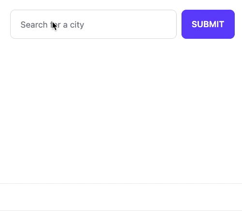
The LiveSelect input is rendered by calling the live_select/3 function and passing it a form and the name of the input.
LiveSelect creates a text input field in which the user can type text, and a hidden input field that will contain the value of the selected option.
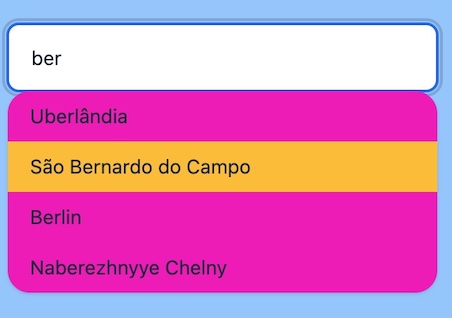
As the text changes, LiveSelect will render a dropdown below the text input
containing the matching options, which the user can then select.
Selection can happen either using the keyboard, by navigating the options with the arrow keys and then pressing enter, or by clicking an option with the mouse.
Whenever an option is selected, LiveSelect will trigger a standard phx-change event in the form. See the "Examples" section
below for details on how to handle the event.
After an option has been selected, the selection can be undone by clicking on text field.
reacting-to-user-s-input
Reacting to user's input
Whenever the user types something in the text input, LiveSelect sends a LiveSelect.ChangeMsg.t/0 message to your LiveView.
The message has a text property containing the current text entered by the user, and a field property with the name of the LiveSelect input field.
The LiveView's job is to handle_info/2 the message and then call update_options/2
to update the dropdown's content with the new set of selectable options. See the "Examples" section below for details.
styling
Styling
You can use the style option in live_select/3 to control which style will be used by default. Currently supported values are
:daisyui (default) or :none (no predefined styles). Support for vanilla Tailwind styles is planned for the future. LiveSelect can style the following elements:
- The outer container of the component
- The text field
- The text field when an option has been selected
- The dropdown with the options
- The active option the user navigated to using the arrow keys
For each of these components there is a {component}_class and for some a {component}_extra_class option, which can be used
to either override or extend the default CSS classes for the component
The following table shows the default styles for each component and the options you can use to adjust its CSS classes.
| Component | Default daisyUI classes | class override option | class extend option |
|---|---|---|---|
| outer container | "dropdown" | container_class | container_extra_class |
| text field | "input input-bordered" | text_input_class | text_input_extra_class |
| text field selected | "input-primary text-primary" | text_input_selected_class | |
| dropdown | "dropdown-content menu menu-compact shadow rounded-box" | dropdown_class | dropdown_extra_class |
| active option | "active" | active_option_class |
For example, if you want to show a full-width LiveSelect component with a secondary color for the dropdown background and active options with a warning background, you can do this:
live_select(form, field,
    container_extra_class: "w-full",
    text_input_extra_class: "w-full",
    dropdown_extra_class: "w-full bg-secondary",
    active_option_class: "bg-warning"
  )
Result:
examples
Examples
Here's an example that describes all the moving parts in detail. The user can search for cities.
The LiveSelect main form input is called city_search.
When a city is selected, the coordinates of that city will be the value of the form input.
Then name of the selected city is available in the text input field named city_search_text_input.
Template:
<.form for={:my_form} let={f} phx-change="change">
    <%= live_select f, :city_search %>
</.form>
LiveView:
import LiveSelect

@impl true
def handle_info(%LiveSelect.ChangeMsg{} = change_msg, socket) do
  cities = City.search(change_msg.text)
  # cities could be:
  # [ {"city name 1", [lat_1, long_1]}, {"city name 2", [lat_2, long_2]}, ... ]
  #
  # but it could also be (no coordinates in this case):
  # [ "city name 1", "city name 2", ... ]
  #
  # or:
  # [ [key: "city name 1", value: [lat_1, long_1]], [key: "city name 2", value: [lat_2, long_2]], ... ]

  update_options(change_msg, cities)

  {:noreply, socket}
end

@impl true
def handle_event(
      "change",
      %{"my_form" => %{"city_search_text_input" => city_name, "city_search" => city_coords}},
      socket
    ) do
  IO.puts("You selected city #{city_name} located at: #{city_coords}")

  {:noreply, socket}
end
multiple-liveselect-inputs-in-the-same-liveview
Multiple LiveSelect inputs in the same LiveView
If you have multiple LiveSelect inputs in the same LiveView, you can distinguish them based on the input field. For example:
Template:
<.form for={:my_form} let={f} phx-change="change">
    <%= live_select f, :city_search %>
    <%= live_select f, :album_search %>
</.form>
LiveView:
@impl true
def handle_info(%LiveSelect.ChangeMsg{} = change_msg, socket) do
  options =
    case change_msg.field do
      :city_search -> City.search(change_msg.text)
      :album_search -> Album.search(change_msg.text)
    end

  update_options(change_msg, options)

  {:noreply, socket}
end
Link to this section Summary
Functions
Renders a LiveSelect input in a form with a given field name.
Updates a LiveSelect component with new options. change_msg must be the LiveSelect.ChangeMsg.t/0 originally sent by the LiveSelect,
and options is the new list of options that will be used to fill the dropdown.
Link to this section Functions
Renders a LiveSelect input in a form with a given field name.
LiveSelect renders a hidden input with name field which contains the selected option.
The visible text input field will have the name #{field}_text_input.
Opts:
disabled- set this to a truthy value to disable the input fieldplaceholder- placeholder text for the input fielddebounce- number of milliseconds to wait after the last keystroke before sending aLiveSelect.ChangeMsg.t/0message. Defaults to 100ms.search_term_min_length- the minimum length of text in the search field that will trigger an update of the dropdown. It has to be a positive integer. Defaults to 3.style- either:daisyuifor daisyui styling (default) or:nonefor no styling. See the "Styles" section above.container_class- See the "Styles" section above for this and the following options.container_extra_classtext_input_classtext_input_extra_classtext_input_selected_classdropdown_classdropdown_extra_classactive_option_class
Updates a LiveSelect component with new options. change_msg must be the LiveSelect.ChangeMsg.t/0 originally sent by the LiveSelect,
and options is the new list of options that will be used to fill the dropdown.
The set of accepted options values are the same as for Phoenix.HTML.Form.select/4, with the exception that optgroups are not supported yet.
Note that the option values, if they are not strings, will be JSON-encoded. Your LiveView will receive this JSON-encoded version in the phx-change and phx-submit events.