View Source LiveSelect (LiveSelect v1.7.5)
The LiveSelect component is rendered by calling the live_select/1 function and passing it a form field.
LiveSelect creates a text input field in which the user can type text, and hidden input field(s) that will contain the value of the selected option(s).
Whenever the user types something in the text input, LiveSelect triggers a live_select_change event for your LiveView or LiveComponent.
The message has a text parameter containing the current text entered by the user, as well as id and field parameters with the id of the
LiveSelect component and the name of the LiveSelect form field, respectively.
Your job is to handle the event, retrieve the list of selectable options and then call Phoenix.LiveView.send_update/3
to send the list of options to LiveSelect. See the "Examples" section below for details, and check out the
cheatsheet for some useful tips.
Selection can happen either using the keyboard, by navigating the options with the arrow keys and then pressing enter, or by clicking an option with the mouse.
Whenever an option is selected, LiveSelect will trigger a standard phx-change event in the form. See the "Examples" section
below for details on how to handle the event. In single and tags mode, the content of the input text field and the list of selectable options are cleared on selection.
To suppress this behavior, use the keep_options_on_select flag in the assigns.
In single mode, if the configuration option allow_clear is set, the user can manually clear the selection by clicking on the x button on the input field.
In tags mode, single tags can be removed by clicking on them.
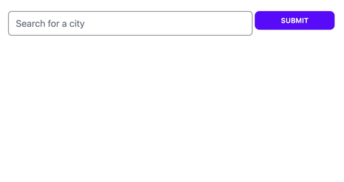
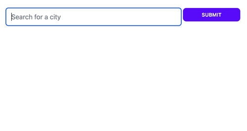
Single mode
Tags mode
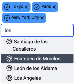
When :tags mode is enabled LiveSelect allows the user to select multiple entries. The entries will be visible above the text input field as removable tags.
The selected entries will be passed to your live view's change and submit event handlers as a list of entries, just like an HTML <select> element with multiple attribute would do.
Quick tags mode

When :quick_tags mode is enabled, the user can select multiple entries, but the dropdown stays open after selection.
This allows the user to select additional entries in quick succession. Also, the entries can be deselected via the dropdown (as well as by clicking on the removable tags).
The dropdown closes when the LiveSelect element loses focus.
Options
You can set the initial list of options the user can choose from with the options assign.
Afterwards, you can update the options at any time using Phoenix.LiveView.send_update/3.
Each option will be assigned a label, which will be shown in the dropdown, and a value, which will be the value of the
LiveSelect input when the option is selected.
options can be any enumeration of the following elements:
- atoms, strings or numbers: In this case, each element will be both label and value for the option
- tuples:
{label, value}corresponding to label and value for the option - maps:
%{label: label, value: value}or%{value: value} - keywords:
[label: label, value: value]or[value: value]
Options can also be disabled when passing in tuples, maps or keywords. Disabled options are displayed, but can't be selected.
Maps and keywords need a :disabled key with a boolean value, and tuples should be a 3 element tuple of {label, value, is_disabled}
In the case of maps and keywords, if only value is specified, it will be used as both value and label for the option.
Because you can pass a list of tuples, you can use maps and keyword lists to pass the list of options, for example:
%{Red: 1, Yellow: 2, Green: 3}Will result in 3 options with labels :Red, :Yellow, :Green and values 1, 2, and 3.
Note that the option values, if they are not strings, will be JSON-encoded. Your LiveView will receive this JSON-encoded version in the phx-change and phx-submit events.
Styling
LiveSelect supports 3 styling modes:
tailwind: uses standard tailwind utility classes (the default)daisyui: uses daisyUI classes.none: no styling at all.
Please see the styling section for details
Alternative tag labels
Sometimes, in :tags mode, you might want to use alternative labels for the tags. For example, you might want the labels in the tags to be shorter
in order to save space. You can do this by specifying an additional tag_label key when passing options as map or keywords. For example, passing these options:
[%{label: "New York", value: "NY", tag_label: "NY"}, %{label: "Barcelona", value: "BCN", tag_label: "BCN"}]will result in "New York" and "Barcelona" being used for the options in the dropdown, while "NY" and "BCN" will be used for the tags (and the values).
Sticky options
Add the sticky: true flag to an option to prevent it from being removed from the selection:
[%{label: "New York", value: "NY", sticky: true}]Now, whenever the selection contains "New York", the option will stick and the user won't be able to remove it.
Slots
Options and tags
You can control how your options and tags are rendered by using the :option and :tag slots.
Both slots will be passed an option as argument. In the case of the :option slot, the option will have an
extra boolean field :selected, which will be set to true if the option has been selected by the user.
Let's say you want to show some fancy icons next to each option in the dropdown and the tags:
<.live_select
field={@form[:city_search]}
phx-target={@myself}
mode={:tags}
>
<:option :let={option}>
<div class="flex">
<.globe /> <%= option.label %>
</div>
</:option>
<:tag :let={option}>
<.check /> <%= option.label %>
</:tag>
</.live_select>Here's the result:
Clear button
You can use the :clear_button slot to directly specify the inner HTML
of the button that clears the tags or the single selection (if allow_clear is set).
Example:
<.live_select
    field={@form[:city_search]}
    phx-target={@myself}
  >
    <:clear_button>
      This my fancy clear button
    </:clear_button>
</.live_select>
Controlling the selection programmatically
You can always control the selection programmatically, overriding the current user-selected values,
by sending a :value update to LiveSelect via Phoenix.LiveView.send_update/3:
send_update(LiveSelect.Component, id: live_select_id, value: new_selection)new_selection must be a single element in :single mode, a list in :tags mode. If it's nil, the selection will be cleared.
After updating the selection, LiveSelect will trigger a change event in the form.
To set a custom id for the component to use with Phoenix.LiveView.send_update/3, you can pass the id assign to live_select/1.
Examples
These examples describe all the moving parts in detail. You can see these examples in action, see which messages and events are being sent, and play around with the configuration easily with the showcase app.
Single mode
The user can search for cities.
The LiveSelect main form input is called city_search.
When a city is selected, the coordinates of that city will be the value of the form input.
The name of the selected city is available in the text input field named city_search_text_input.
Template:
<.form for={@form} phx-change="change">
  <.live_select field={@form[:city_search]} />
</.form>
Forms implemented in LiveComponents
If your form is implemented in a LiveComponent and not in a LiveView, you have to add the phx-target attribute
when rendering LiveSelect:
<.live_select field={@form[:city_search]} phx-target={@myself} />LiveView or LiveComponent that is the target of the form's events:
@impl true
def handle_event("live_select_change", %{"text" => text, "id" => live_select_id}, socket) do
    cities = City.search(text)
    # cities could be:
    # [ {"city name 1", [lat_1, long_1]}, {"city name 2", [lat_2, long_2]}, ... ]
    #
    # but it could also be (no coordinates in this case):
    # [ "city name 1", "city name 2", ... ]
    #
    # or:
    # [ [label: "city name 1", value: [lat_1, long_1]], [label: "city name 2", value: [lat_2, long_2]], ... ]
    #
    # or even:
    # ["city name 1": [lat_1, long_1], "city name 2": [lat_2, long_2]]

    send_update(LiveSelect.Component, id: live_select_id, options: cities)

    {:noreply, socket}
end

@impl true
def handle_event(
    "change",
    %{"my_form" => %{"city_search_text_input" => city_name, "city_search" => city_coords}},
    socket
  ) do
    IO.puts("You selected city #{city_name} located at: #{city_coords}")

    {:noreply, socket}
end
Tags mode
Let's say you want to build on the previous example and allow the user to select multiple cities and not only one.
The :tags mode allows you to do exactly this.
Template:
<.form for={@form} phx-change="change">
  <.live_select field={@form[:city_search]} mode={:tags} />
</.form>
LiveView or LiveComponent that is the target of the form's events:
@impl true
def handle_event(
    "change",
    %{"my_form" => %{"city_search" => list_of_coords}},
    socket
  ) do
  # list_of_coords will contain the list of the JSON-encoded coordinates of the selected cities, for example:
  # ["[-46.565,-23.69389]", "[-48.27722,-18.91861]"]

  IO.puts("You selected cities located at: #{list_of_coords}")

  {:noreply, socket}
end
Multiple LiveSelect inputs in the same LiveView
If you have multiple LiveSelect inputs in the same LiveView, you can distinguish them based on the field id. For example:
Template:
<.form for={@form} phx-change="change">
  <.live_select field={@form[:city_search]} />
  <.live_select field={@form[:album_search]} />
</.form>
LiveView or LiveComponent:
@impl true
def handle_event("live_select_change", %{"text" => text, "id" => live_select_id, "field" => live_select_field}, socket) do
  options =
    case live_select_field do
      "form_name_city_search" -> City.search(text)
      "form_name_album_search" -> Album.search(text)
    end

  send_update(LiveSelect.Component, id: live_select_id, options: options)

  {:noreply, socket}
end
Using LiveSelect with associations and embeds
LiveSelect can also be used to display and select associations or embeds without too much effort. Let's say you have the following schemas:
defmodule City do
  @moduledoc false

  use Ecto.Schema

  import Ecto.Changeset

  @primary_key false
  embedded_schema do
    field(:name)
    field(:pos, {:array, :float})
  end

  def changeset(%__MODULE__{} = schema \\ %__MODULE__{}, params) do
    cast(schema, params, [:name, :pos])
  end
end

defmodule CitySearchForm do
  use Ecto.Schema

  import Ecto.Changeset

  embedded_schema do
    embeds_many(:city_search, City, on_replace: :delete)
  end

  def changeset(schema \\ %__MODULE__{}, params) do
    cast(schema, params, [])
    |> cast_embed(:city_search)
  end
end
Each city has a name and an array with coordinates - we want LiveSelect to display the name as label in the dropdown and in the tags, but we want
the entire data structure (name + coordinates) to be sent to the server when the user selects.
In order for this to work, we need to:
- Map
Citystructs to the options expected byLiveSelect - Decode
CityJSON objects sent by the client
We do (1) by passing a value_mapper assign to LiveSelect. This is a 1-arity function that expects the struct and maps it to the option that LiveSelect should use:
<.live_select field={@form[:city_search]} value_mapper={&value_mapper/1} mode={:tags} />defp value_mapper(%City{name: name} = value) do
%{label: name, value: value}
endAs you can see, the label is the name of the city whereas the value is the entire struct. This is because we want to be able to recreate the struct from the value, so we need everything. LiveSelect
uses value_mapper/1 to map the values set in the form to the options expected by LiveSelect.
You can also use the value_mapper/1 function to map values to options when updating the list of options while handling live_select_change:
def handle_event("live_select_change", %{"text" => text, "id" => live_select_id}, socket) do
  options =
    retrieve_options()
    |> Enum.map(&value_mapper/1)

  send_update(LiveSelect.Component, id: live_select_id, options: options)

  {:noreply, socket}
end
IMPORTANT: the output of the value_mapper/1 function should be JSON-encodable
Finally, in order to take care of (2) you need to decode the JSON-encoded list of options that's coming from the client before you can
cast them to create a changeset. To do so, LiveSelect offers a convenience function called LiveSelect.decode/1:
def handle_event("change", params, socket) do
  # decode will JSON-decode the value in city_search, handling the type of selection
  # and taking care of special values such as "" and nil
  params = update_in(params, ~w(city_search_form city_search), &LiveSelect.decode/1)

  # now we can cast the params:
  changeset = CitySearchForm.changeset(params)

  {:noreply, assign(socket, form: to_form(changeset))}
end
That's it! Now Your form with embeds selected and displayed with LiveSelect should work
Summary
Components
Renders a LiveSelect input in a form.
Functions
Decodes the selection from the client. This has to be used when the values in the selection aren't simple integers or strings.
Components
Renders a LiveSelect input in a form.
Attributes
field(:any) (required) - a Phoenix.HTML.FormField struct identifying the form's field.id(:string) - an id to assign to the component. If none is provided,#{form_name}_#{field}_live_select_componentwill be used.mode(:atom) - either:single(for single selection),:tags(for multiple selection using tags), or:quick_tags(multiple selection but tags can be selected/deselected in quick succession). Defaults to:single.options(:list) - initial available options to select from. Note that, after the initial rendering of the component, options can only be updated usingPhoenix.LiveView.send_update/3- See the "Options" section for details.keep_options_on_select(:boolean) - iftrue, the current list of selectable options and the content of the input text field are preserved upon selection.value(:any) - used to manually set a selection - overrides any values from the form. Must be a single element in:singlemode, or a list of elements in:tagsmode.max_selectable(:integer) - limits the maximum number of selectable elements.0means unlimited. Defaults to0.user_defined_options(:boolean) - iftrue, hitting enter will always add the text entered by the user to the selection. Defaults tofalse.allow_clear(:boolean) - iftrue, when in single mode, display a "x" button in the input field to clear the selection.disabled(:boolean) - set this totrueto disable the component.placeholder(:string) - placeholder text for the input field.debounce(:integer) - number of milliseconds to wait after the last keystroke before triggering a "live_select_change" event. Defaults to100.value_mapper(:any) - function used to map the values from a form to LiveSelect options. Important: the output of this function should be JSON-encodable.update_min_len(:integer) - the minimum length of text in the text input field that will trigger an update of the dropdown. Defaults to1.style(:atom) - one of:tailwind,:daisyuior:none. See the Styling section for details. Defaults to:tailwind.phx-target(:any) - Optional target for events. Usually the same target as the form's.phx-blur(:string) - Event to emit when the text input loses focus. The component id will be sent in the event's params.phx-focus(:string) - Event to emit when the text input receives focus. The component id will be sent in the event's params.no_basic_styles_for_clear_buttons(:boolean) - Do not apply basic size and positioning styles to clear buttons.
Slots
option- optional slot that renders an option in the dropdown. The option's data is available via:let.tag- optional slot that renders a tag. The option's data is available via:let.clear_button- optional slot to render a custom clear button.
Styling attributes
- See the styling section for details
Functions
Decodes the selection from the client. This has to be used when the values in the selection aren't simple integers or strings.
Let's say you receive your params in the variable params, and your LiveSelect field is called my_field and belongs to the form my_form. Then you should
decode like this:
params = update_in(params, ~w(my_form my_field), &LiveSelect.decode/1)Examples:
iex> decode(nil) []
iex> decode("") nil
iex> decode("{\"name\":\"Berlin\",\"pos\":[13.41053,52.52437]}") %{"name" => "Berlin","pos" => [13.41053,52.52437]}
iex> decode(["{\"name\":\"New York City\",\"pos\":[-74.00597,40.71427]}","{\"name\":\"Stockholm\",\"pos\":[18.06871,59.32938]}"]) [%{"name" => "New York City","pos" => [-74.00597,40.71427]}, %{"name" => "Stockholm","pos" => [18.06871,59.32938]}]