View Source LiveSelect

Dynamic (multi)selection field for LiveView.
LiveSelect is a LiveView component that implements a dynamic selection field with a dropdown. The content of the
dropdown is filled by your LiveView as the user types. This allows you to easily create an
interface for search-like functionalities with type-ahead. LiveSelects features include:
- Single as well as multiple selection
- Options to configure the behaviour, such as minimum number of characters that trigger an update or the maximum number of selectable options
- Default styles for daisyUI and tailwindcss, which are fully customizable and can be completely overridden if needed
- Ability to customize the rendered HTML for dropdown entries and tags using slots.
Try it in the showcase app 🔬
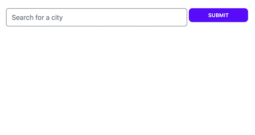
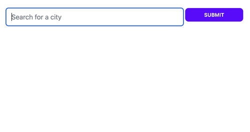
Single selection (single mode)
Multiple selection (tags mode)
Multiple selection (quick_tags mode)

Usage Example 🧭
Template:
  <.form for={@form} phx-change="change">
    <.live_select field={@form[:city_search]} />
  </.form>
NOTE: If your form is implemented in a LiveComponent, add phx-target={@myself}, like this:
<.live_select field={@form[:city_search]} phx-target={@myself} />In the LiveView or LiveComponent that's the target of your form events:
  @impl true
  def handle_event("live_select_change", %{"text" => text, "id" => live_select_id}, socket) do
    cities = City.search(text)
    # cities = [
    # {"New York City", [-74.00597,40.71427]},
    # {"New Kingston", [-76.78319,18.00747]},
    # ...
    # ]

    send_update(LiveSelect.Component, id: live_select_id, options: cities)

    {:noreply, socket}
  end

  @impl true
  def handle_event(
        "change",
        %{"my_form" => %{"city_search_text_input" => city_name, "city_search" => city_coords}},
        socket
      ) do
    IO.puts("You selected city #{city_name} located at: #{city_coords}")

    {:noreply, socket}
  end
Refer to the module documentation for the details, and check out the cheatsheet for some useful tips.
Installation 📦
To install, add this to your dependencies:
[
    {:live_select, "~> 1.0"}
]
Javascript hooks 🪝
LiveSelect relies on Javascript hooks to work. You need to add LiveSelect's hooks to your live socket.
LiveSelect distributes its Javascript code (a single file) in the same way as LiveView, by including an
npm package as part of its hex package.
To include LiveSelect's hooks, add this to your app.js file:
import live_select from "live_select"

// if you don't have any other hooks:
let liveSocket = new LiveSocket("/live", Socket, {params: {_csrf_token: csrfToken}, hooks: live_select})

// if you have other hooks:
const hooks = {
    MyHook: {
        // ...
    },
    ...live_select
}
let liveSocket = new LiveSocket("/live", Socket, {params: {_csrf_token: csrfToken}, hooks})
If you're using Webpack or another NPM-based builder
If you're using an npm-based builder such as Webpack, you will need to add LiveSelect to the list of your dependencies in your package.json (just as you did with LiveView):
{
  "dependencies": {
    "phoenix": "file:../deps/phoenix",
    "phoenix_html": "file:../deps/phoenix_html",
    "phoenix_live_view": "file:../deps/phoenix_live_view",
    "live_select":  "file:../deps/live_select" // <-- add this line, and add an extra "../" if you're in an umbrella app
  }
}
And then run npm install from your assets folder. You will also need to run npm install --force live_select
whenever you update the LiveSelect hex package in order to get the latest JS code.
Styling 🎨
LiveSelect supports 3 styling modes:
tailwind: uses standard tailwind utility classes (the default)daisyui: uses daisyUI classes.none: no styling at all.
The choice of style is controlled by the style option
in live_select/1.
tailwind and daisyui styles come with sensible defaults which can be selectively extended or completely overridden.
Refer to the Styling section for further details.
⚠️ Attention
Please note the different paths for a standalone or umbrella app.
tailwind v3
If you're using tailwind or daisyui styles, you need to add one of the following lines to the content section in
your tailwind.config.js:
module.exports = {
    content: [
        //...
        '../deps/live_select/lib/live_select/component.*ex', // <-- for a standalone app
        '../../../deps/live_select/lib/live_select/component.*ex' // <-- for an umbrella app
    ]
    //..
}
tailwind v4
If you are using tailwind v4+ and are not using a tailwind.config.js file you instead need to add the relevant @source directive to your app.css file:
@source "../../deps/live_select/lib/live_select/component.*ex" /* for a standalone app */
@source "../../../../deps/live_select/lib/live_select/component.*ex" /* for an umbrella app */
Showcase app 🎪
The repository includes a showcase app that you can use to experiment with the different options and parameters
for LiveSelect.
The showcase app is available here.
To start the showcase app locally, simply run:
mix setup
PORT=4001 mix phx.server
from within the cloned repository. The app will be available at http://localhost:4001. The showcase app allows you to
quickly experiment with options and styles, providing an easy way to fine tune your LiveSelect component. The app also
shows the messages and events that your LiveView receives. For each event or message, the app shows the function head
of the callback that your LiveView needs to implement in order to handle the event.
Contribute 🤝
Contributions are very welcome! However, if you want do add a new feature please discuss it first by creating an issue so we can all agree that it's needed. Also, it's important to add a test that covers it. If you don't know how to write the test or need guidance, I'm happy to help.
Use mix test to run the entire test suite, which is subdivided into 3 main files:
test/live_select/component_test.exs- everything that can be tested by rendering the component staticallytest/live_select_test.exs- tests forsinglemode that require a running LiveViewtest/live_select_tags_test.exs- tests fortagsmode that require a running LiveViewtest/live_select_quick_tags_test.exs- tests forquick_tagsmode that require a running LiveView
Tests that require a LiveView use the showcase app as the parent LiveView.
Roadmap 🛣️
- [X] Add
package.jsonto enableimport live_select from "live_select" - [X] Make sure component classes are included by tailwind
- [X] Enable custom styling
- [X] Rename LiveSelect.render to live_select
- [X] Customizable placeholder
- [X] Enable configuration of styles in the showcase app
- [X] Add support for vanilla tailwind styles
- [X] Enable multiple selection mode
- [X] Expose as function component (and drop LV 0.17 support)
- [X] Add cheatsheet
- [X] Additional multiple selection mode
- [ ] Add section to document testing strategies